Monday, January 4, 2021

Three Constitutions


Over the last four years the content of my printing has steadily changed. The political and social upheavals that have riven this country into splinters have slowly seeped into my work. It has not been an entirely welcome change—I have never been a fan of overtly political artists' books—so I have been exploring ways in which I can make politically-inspired work that is both consistent with my aesthetics, and meaningful without being preachy or self righteous. It is a difficult balance to strike. 
 
While choosing the texts for my book Character Traits (2017–2019) I noticed that my choices were colored by the absurdity of our President and his enablers. I was not trying to make a political statement with the book, but the politics edged itself in all the same. The hyper-politicization that was infecting every aspect of my daily life could not be kept out of my work. Surprisingly, my timidity about bringing politics into my books was absent in my ephemeral work, and I began printing small mailings that allowed me to directly express my frustration, anger, and helplessness. 
 
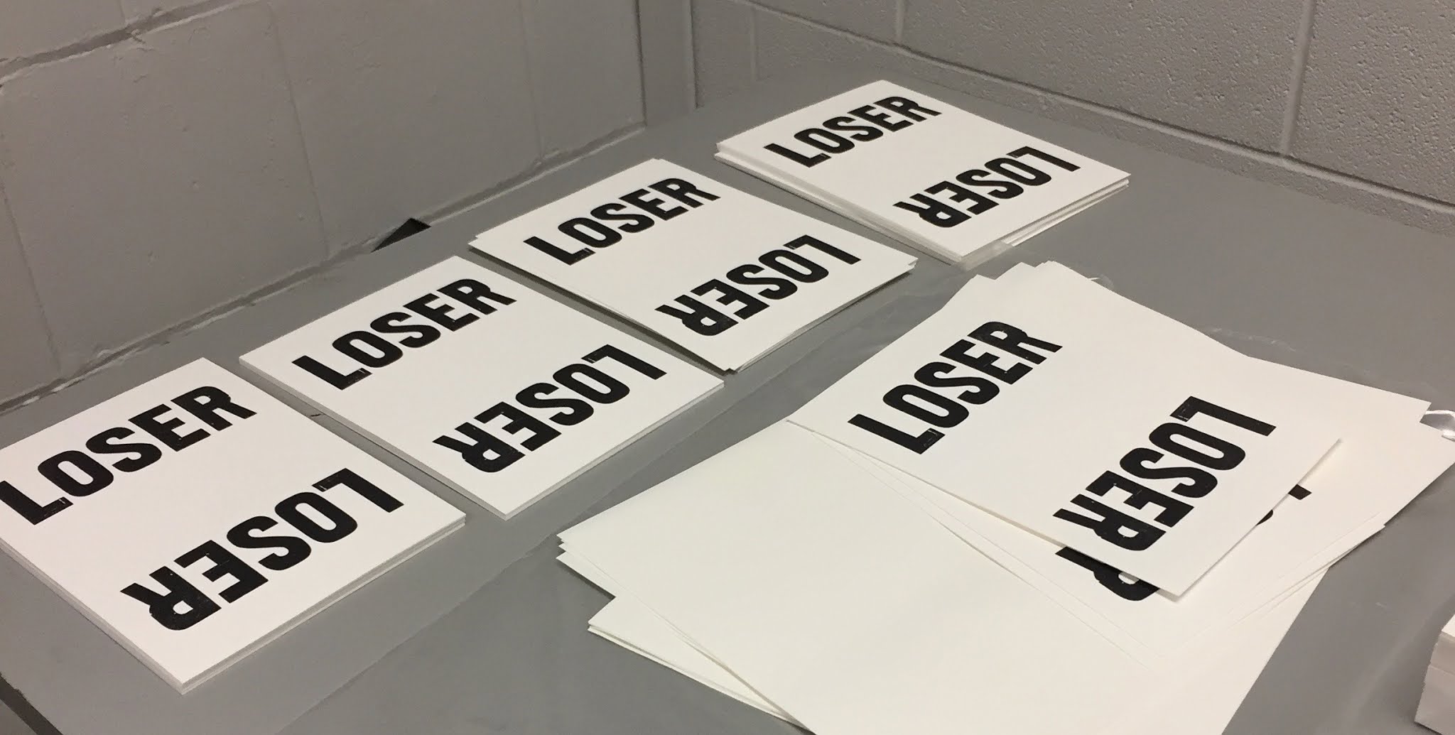
My "LOSER" postcard sent to Donald 'Jailbait' Trump at the White House after Joe Biden's victory.

Character Traits provoked another significant realization about how my lettering and type design relate to the content of my books. Historically, my lettering has been divided into two distinct categories: large, interpretative letterforms on one hand, and proper, constrained typefaces on the other. For over twenty years I have tried unsuccessfully to find ways for these two alphabetical impulses to merge into some hybrid form. What Character Traits taught me was that it was not the lettering that was preventing me from doing this, rather it was the content of my books. The template I had been using in my work was to isolate my interpretative or abstract letterforms on single pages, and then write notes about them in my more traditional typefaces. In order to merge my two lettering impulses, I had to move on from this approach and change the content of my work.

With all of these ideas swirling in the background I began work on a new book project called Three Constitutions. The book was inspired by the increasingly contentious conflict between "originalists," those who view the Constitution as a prescriptive cultural artifact delineating American "civilization," and those who view the Constitution as a flexible instrument conceived to adapt to the evolving political and social realities of American "nationhood." This is a conflict we are all familiar with, but what got me started working on Three Constitutions was that in the blaring echo chamber of the hourly news cycle, the originalists were, and are, dominating the discussion. 

The problem with these zealous, self-described Constitutional "patriots" is not dissimilar from that of religious zealots: if (and it's a big IF) they have bothered to read their primary document—the Constitution or whatever their holy book happens to be—they have done so through self-justifying blinders. How many Constitutional "originalists," for instance concentrate on the fact that the fourth phrase of the preamble is to "insure domestic Tranquility" or that the sixth is to "promote the general Welfare?" How many self-proclaimed "Proud Boys" understand that the second amendment is an amendment, and therefore provides its own justification for being revisited and amended further? The more likely scenario is that these originalists have not read the original documents at all. Instead they encounter the Constitution at a remove by relying upon the interpretation of others for their beliefs.  

The idea that developed from these musings was to print the Constitution in three ways. One large volume would contain the actual text, but it would be printed in a typeface that is difficult, though not impossible, to read. This volume would be accompanied by two smaller volumes, each of which presented an interpretation of the original text. In thinking about the primary contemporary means of doctrinal interpretation, it struck me that there are two: 1) party apparatchiks (President, senators, media commentators, communities, churches, etc) and 2) the internet/social media. One's party interprets by lopsided emphasis and redaction, resulting in an edited version that fits their political aims. The internet interprets by algorithm—providing you with either a best guess version of what someone like you (or who the algorithm assumes you are) would want to hear, or a version that is determined by the limitations, or motives, of the person who conceived the algorithm. 

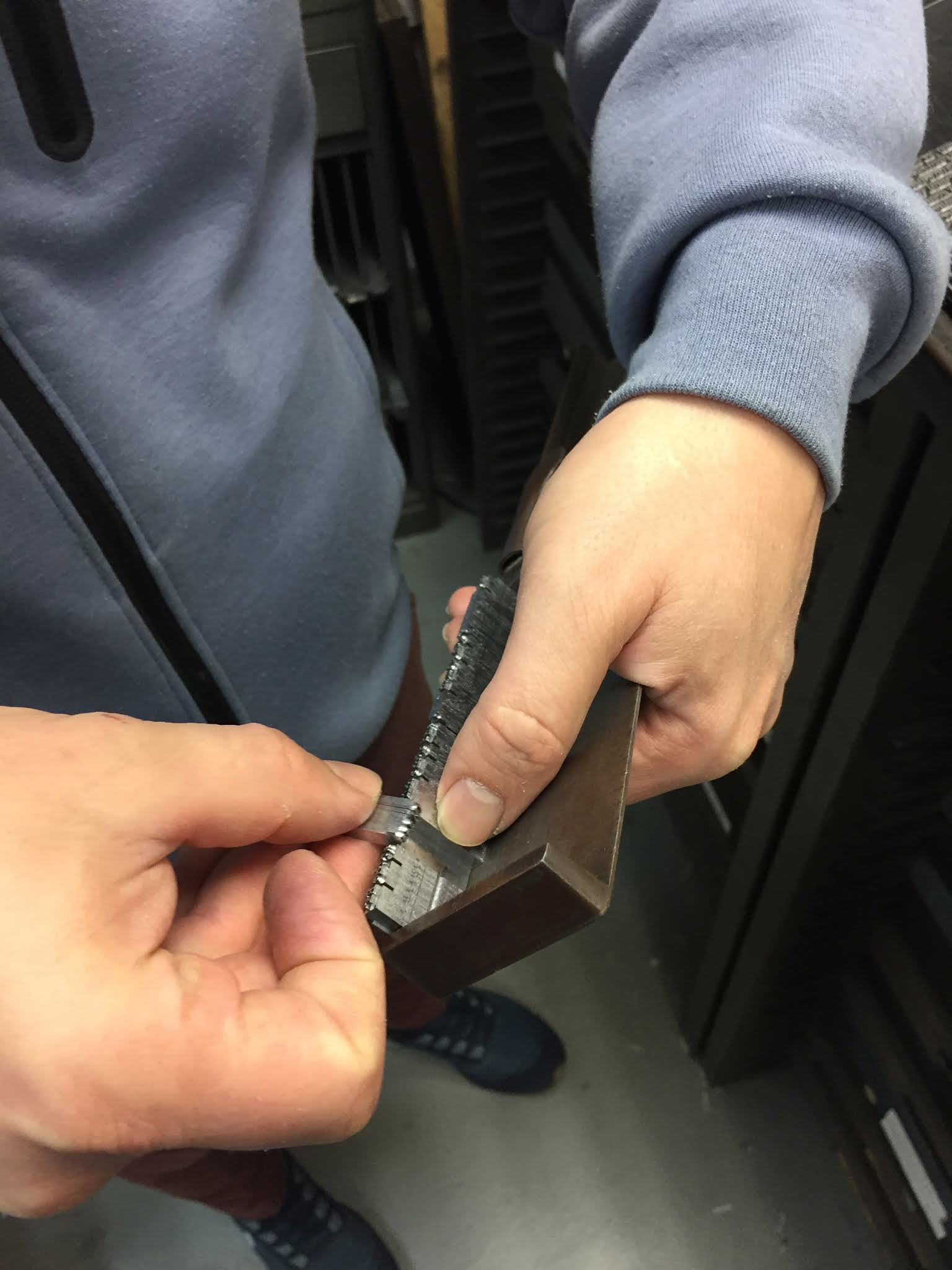
For the redacted version, I had the full text of the Constitution and Amendments set in my Hungry Dutch type. I then went through the text and highlighted key words or phrases to be redacted by physically turning the type upside down. These inverted pieces of type print as black rectangles, resulting in pages that look similar to how redacted government documents look.

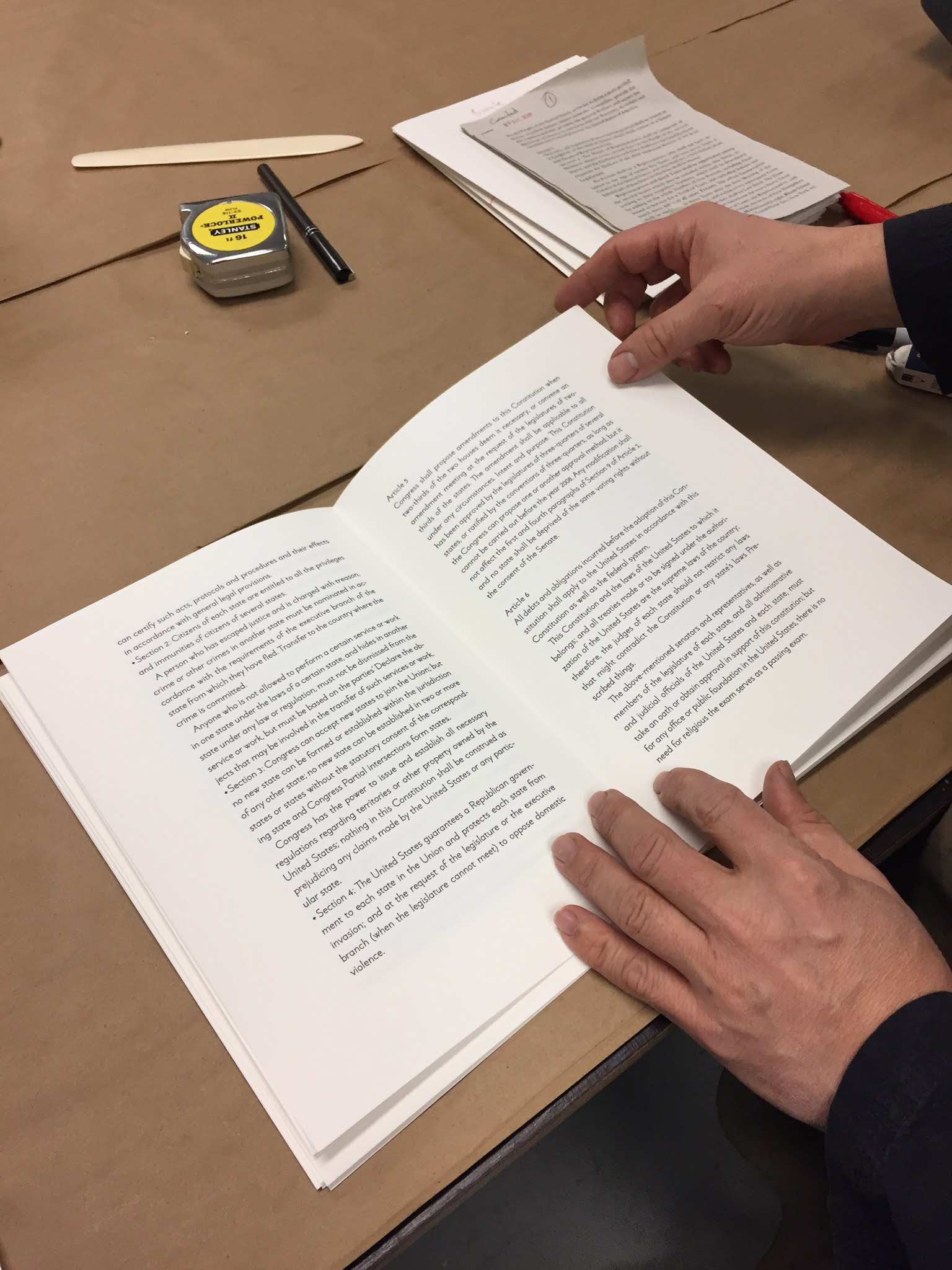
For the internet version, I fed the original text through a series of translations using Google Translate. It was first translated into Esperanto, as an expression of the Utopian ideals behind the text and the language. From Esperanto, the text was then translated into Russian, from Russian to Chinese, and Chinese back to English. The resulting text is something like the original, but different in subtle yet meaningful ways. For this volume I designed a typeface that feels very much like a digital design, using simple geometric forms. 

In the beginning of November my former student Sarah Moody moved in with us to work on the project. Since then we have finished the internet volume and are currently printing the redacted version. Later in the month we'll begin work on the larger volume. Below are a selection of photos of the process so far, mainly taken by Sarah.

 
Freshly cast Hungry Dutch type from Ed Rayher at Swamp Press.

 
Determining page breaks and corrections in the Swamp Press galleys.


 Breaking the type into pages.

 
Galley proofs marked up for redaction.

 
Redacting the type by turning it upside down.

Proofing the redacted type.
 
Correcting the redacted galleys.


The redacted galleys and spread.
 
 
Proofing a spread from the Google translate version.
 
 
Checking position.
 
 
Making ready a spread.
 
 
Checking ink density.

 
Striking a page as printed in the dummy.

 
Paging through a gathered finished copy.

Monday, December 24, 2018

Two Color Intaglio Printing in Character Traits

For the two color plates in Character Traits, I use the same basic process as the one color plates—I apply the ink by squeegee, wipe with tarlatan and newsprint (and hand if needed), and clean the edges—before laying down a top of color ink with brayer. I originally intended for most prints in the book to be two color, but this intention was modified early on when I realized the complexity of the process. It had never occurred to me in the planning stage that I would need to completely clean the plates between each print to prevent the two inks mixing in successive inking and wipings. This adds an enormous amount of time to the process as the plate not only needs to be cleaned but also dried between prints. Additionally, certain plates in which the intaglio image is too fine simply do not work in two colors. The solution was for both the standard and the deluxe copies to contain a few of the same two color prints, while a selection of prints appear in one color in the standard copies and two colors in the deluxe. Below are some images of each step of the process photographed by Annie Schlechter.


Tuesday, April 17, 2018

Photopolymer Intaglio Process used in Character Traits

The intaglio printing process I am using in Character Traits is fairly standard, with just a few peculiarities based on my use of photopolymer plates. For most of the plates, particularly those with thicker line work, I need to modify the ink I'm using by adding a substantial quantity of magnesium carbonate. Without the magnesium, the ink is too easily wiped out of the lines prior to printing, and, during printing, has trouble holding a crisp edge. Polymer plates also present some difficulty during the inking and wiping process due to their light weight—they don't want to sit still, and an already messy process quickly becomes unmanageable. To compensate, I am taking advantage of the plates' steel backing by sticking them on Bunting magnetic bases while inking and wiping. This keeps the plate in place and gives me a larger surface on which to work. To protect the surface of the magnetic bases I place a sheet of stiff cover stock between plate and base. The paper barrier also makes lifting the plate from the magnet much easier than it would be otherwise. 

For most plates, the steps are as follows: 
Place the plate down on the paper-covered magnetic base  


Draw ink across the plate with a plastic squeegee, rocking the edge back and forth to force the ink into the larger areas; scrape the surface of the plate with the squeegee to remove excess ink
Wipe with tarlatan twice (with each tarlatan session I use progressively cleaner pieces of material to prevent ink transferring back to the plate from the tarlatan)
Wipe with the edge of my hand vertically, horizontally, and at 45 degrees. Then wipe a third time with tarlatan
Lift the plate off the magnetic base and use a galley magnet to hold the plate while wiping the edges with mineral spirits


Place a cleaner sheet of paper on the base before replacing the plate (throughout the edition I regular change these sheets of paper to prevent ink transferring back from the paper to the plate during wiping)
Wipe with tarlatan and then polish with newsprint, repeating this process once or twice depending on the plate

Clean the edges one last time
Place the plate on the bed of the press
Then Nancy places the dampened sheet of paper, cranks the press and lifts the print, after which we begin the process again


Sunday, April 8, 2018

Frank Worsley plate from Character Traits


The idea for Character Traits took root while reading The Europeans by Henry James in 2011. As I read the book I found myself copying out a surprisingly long list of descriptions of the novel’s characters. For some time afterward I toyed with the idea of making a lettering book in which I designed unique lettering for each of James’ descriptions. Eventually I put the idea in the back of my mind and went on to other things. Then in 2013, I was struck in quick succession by a few different descriptions of human character traits, most poignantly one by Frank Worsley, the Captain of Ernest Shackleton’s Endurance expedition: “The rapidity with which one can change one’s ideas…and accommodate ourselves to a state of barbarism is wonderful.” Suddenly, the lettering book idea came back to me, but with an added depth. Rather than a specimen of lettering inspired by Henry James’ insightful humor, I began to imagine a book in which the texts reflected a broader picture of the human experience, touching on some of the darker (and/or comedic) realities of the human condition. I began gathering texts in notebooks as I came across them. 

For Worsley's text I wanted lettering that progressively changed from more to less familiar, skirting the edge of illegibility but not quite getting there. Below are two early sketches of the plate, as well as the finished print from both the standard (one color) and deluxe (two colors) editions of Character Traits.