Last autumn I found myself daydreaming about lines. This was not
terribly surprising—I had spent the previous few years concentrating on
color to the near exclusion of line—but it felt unusual in that it was
such a sharp break in my thinking. There was no color involved in my
fantasies, all of my dreamed lines were black and white. Specifically I
was thinking about letterforms composed of intersecting horizontal and
vertical lines, and in my off hours I made some digitally drawn
experiments: a bifolium for the Codex Foundation's publication,
Alchimie du Verbe, and my MMXV new year's card. The results were satisfying, particularly the
Alchimie du Verbe
print, but they did not quite capture what I had in mind. The lines
that I wanted were neither digital nor were they black. Instead, I kept
imagining white lines hand cut from a black surface, and a printed book
of the blocks titled
Linear A to Z. I chose 4 x 6 inch linoleum
blocks as the ideal proportion and medium, and I began making thumbnail
sketches, always stalling at certain key letters that seemed to resist
the linearity, or the proportion, or both.
Detail of Alchimie du Verbe print.
Quick thumbnail sketches of linear letterforms.
Full scale sketch of linear Q from Linear A to Linear Z.
The Q block in process.
A
few months later I began sketching the letterforms at actual size,
working through the alphabet fairly quickly with the exception of those
same obstinate letters. During the process I found myself wanting to use
an awl to make circular dot marks in a block. My mind revolted against
the thought.
No, no, you can't do that! This is an alphabet of lines!
This resistance to intuition after a system has been developed is the
most challenging hurdle in designing an alphabet, particularly
when the alphabet is based so clearly on geometric forms. In every
geometric alphabet I have drawn there has been a similar moment of
reckoning, a crescendo of head-banging-against-wall until the
wall finally breaks, and the rigid geometric system is either loosened
or abandoned all together. Despite their gathering into a seemingly
homogeneous alphabetical group, letterforms are diverse. They have
individual histories, potentials, and, on a basic level, they have
different parts: horizontals/verticals, diagonals, and curves. Different
letters need to be approached differently.
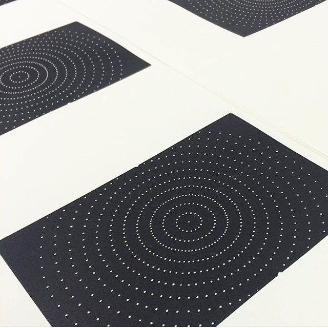
As if to
prove the point, the first block I cut of my linear alphabet was an O
composed of hundreds of tiny round dots, with nary a line in sight.
Eventually I settled on three kinds of marks that gave me enough
flexibility to produce the twenty-six letterforms: the line; the dot;
and the wedge (a cuneiform-like mark made by driving a V-shaped cutting
tool deeper into the block). For some letters these marks are used in
ways that might be expected—the dot for the O, the line for the L, etc.
For others they are not. In any case, the use of these different marks
required a re-visiting of the title.
Linear A to Z implied that all of the letters were composed of lines, which was no longer true.
Linear A to Linear Z,
on the other hand, described the marks used to make the A and Z while
leaving room for the intermediary letters to be constructed by other means.
Detail of lines used on the A block.
Detail of dot marks used on the F block.
Detail of wedge marks used on the X block.
Linear A
is the earliest known Aegean script, discovered by Sir Arthur Evans
while excavating in Crete in 1900. Used by the Minoans in the early
second millenium BCE,
Linear A shares many characters in common with the later
Linear B script of the Mycenaeans but, unlike
Linear B,
Linear A
remains undeciphered. As the Mycenaeans succeeded the Minoans as the
region's dominant culture, it is not too great a stretch to search for a
link between the two scripts, but attempts to apply character values
from
Linear B to the same characters in
Linear A results
in gibberish. That a familiar form can have multiple meanings, or be
legible in one instance and inaccessible in another, strikes me as an
illuminating insight into the struggle of mark making in general,
and letter design in particular. It is also a model for the letterforms I
designed for the book, which are not intended to be immediately
recognizable as the A, B, Cs we commonly use, but as forms and shapes
that evoke the twenty-six Roman capitals. They are meant to be A, B, Cs
that can also be something else entirely.