Monday, December 9, 2013

Interstices & Intersections: Cube Design for Euclid's Proposition viii.15

Last week I finally finished printing the twelve color design for proposition viii.15 from Interstices & Intersections. The print bleeds off three sides of the sheet and covers a total area of 11 x 13.5 inches. Ten of the plates register across the entire area, a fact that has been tormenting me since I first painted the design back in April. I have never tried to register two colors over so large an area, the thought of ten froze me in my tracks. I procrastinated for months before finally re-drawing the design in separation. Even then I tried to cut corners. In the lead up to printing I tried everything I could to find a more expedient approach to the printing, fooling myself for a couple of months that I would be able to get away with a mere six plates/colors. I would mix and remix colors but every proof looked flat and lifeless. When compared to the original painting the proofs were completely discouraging. My solution was to draw a series of pencil drawings that would be printed over the flat areas of color. I began by printing the outline in a purply black and the four principal flat colors in subtle tones of hand-ground inks: Venetian red, Bohemian green earth, yellow ochre, and burnt umber. I then printed the pencil drawings on top of these in darker inks of a slightly different hue. After these nine plates the white tops of the cubes took on an unsettling fluorescence which I toned down with a subtle cream, before filling in the center gray background with a warm putty overlaid with a bluish gray.

 The original watercolor painting.

 One of the six color proofs.

 The final twelve color print.

 A video of the state and progressive proofs leading to the final print.

Thursday, October 17, 2013

Clover image from Interstices & Intersections

In the run-up to the Oxford Fine Press Fair on November 2 and 3, I have been working flat out to have as much of Interstices & Intersections printed (or proofed) for a new mock-up to show at the fair. The schedule has made blogging nearly impossible. At the end of the day I'm simply too tired to reflect and write about my process. With the dummy sheets finally off to Daniel Kelm for binding the mock-up, Annie came by the studio yesterday and photographed every state and progressive proof to date, as well as the proofed images for the dummy. I'll write about a few more of the images over the next few weeks but in the meantime I'll just deal with the clover image from Proposition 6.30.

I begin by drawing an outline of my clover patch in pencil and then scanning and re-drawing it in outline in Illustrator.

I then divide the clover petals into four different densities
Creating four levels within the image

I then draw highlights for each level in separation

Re-combining and inverting them digitally
Producing a plate that prints as so

I then create a four-tiered shadow that I print in a gray made of equal parts orange and black
For the final image below

Tuesday, October 8, 2013

Printing, printing

For the last two months I have been printing all out, cranking the Vandercook 5,000-7,000 times a week, trying to keep ahead of the curve on Interstices & Intersections. The first big deadline is approaching, The Oxford Fine Press Book Fair, and all of my energy has been geared toward preparing as complete a dummy of the book as possible to show at the fair. The schedule has been so tiring that it has been hard to take a moment and write clear-headed blog entries, a task I am still not up to. After I send the dummy sheets to the binder next week, though, I'll sift through all of the process photos and put together a more interesting post. In the meantime, here's a photo of the first text plates. I'll never tire of the seeing the transformation that text enacts on a page.


Sunday, September 1, 2013

The First Month of Printing Interstices & Intersections

After a bit of a rocky start setting up, life in the studio is now moving at a steady pace. The day begins with a 7.5 mile bike ride downtown, over the Williamsburg Bridge, and on to the studio on Flushing Avenue, where I print for seven or eight hours, and then turn around and bike back home. As it stands now, my intention is to print for one month stretches, followed by a week of drawing and writing at home in preparation for the next month of printing. These breaks in the schedule are critical. By the end of the month, the print work begins to feel more like drudgery than creativity, and the prospect of being at my drawing table at home fills me with nostalgia. Once home, I throw myself into the chaos of tracing paper, tape, pencils, and pens that my table quickly becomes until, after a week or so, I get antsy to proof what I have done, to see if the colors of my separations work together on paper the way they do in mind (they rarely do). Even though I paint and draw more than I used to do, I still do not consider an image complete until it is printed. This casts my drawings in an interesting light—until they are printed my drawings are purely hypothetical, they are propositions for prints that often do not work in practice. When they do work, the process begins again and all I can do is print, print, print.

Unlike my drawing table, my print shop is kept in rigorous order for the duration of the project (though the order tends to slip noticeably in the final stretch). The book is composed of thirteen propositions, each of which carries over two spreads. Each spread is alotted one hundred sheets of Zerkall Litho 250gm paper for the standard edition; the requisite number of sheets for two complete sets of state and progressive proofs; and twenty to twenty-six sheets (depending on the spread's complexity) of Twinrocker Handmade Paper's cotton & abaca paper for the deluxe. Each proposition has a shelf, each spread a side of that shelf, and on and on it goes.

My approach to the book is to print the images first and the text last. I always prefer to print the most difficult thing first, in case of error there is less to reprint. I also want to give the text the most time to rest and germinate before committing it to paper. In the end, I am more confident in my ability to draw a triangle than I am in my ability to describe what that triangle means to me. All of the spreads pictured below are therefore lacking a critical element: the words. Without the words, many of the spreads can seem disjointed and out of place among one another. The images on them are just images and the key to their understanding is contained in the text. That text, in turn, is composed of thirteen shorter texts which are themselves each related to a book of Euclid's The Elements. So when looking at the photos below, try to imagine text where all of the large white spaces are. Some of it is shaped in unexpected ways, some in the way you might expect.

This is the opening spread of the book, for proposition i.19. Although it looks simple, the image required eighteen cranks of the press to achieve the thickly layered colors (the red is actually four coats of ink, two of solid red with two scumbles of yellow on top).

 
This comparatively pale image follows it, a five color rendition of a sheet of loose leaf paper showing the folding diagram for a paper football.

The opening spread for proposition iii.1 so far has six impressions (both the blue and yellow are double hit).

The second spread for iii.1 with six of the ten plates that will eventually be required. Many of the subtleties are lost in the digital reproduction but the blue ink on the basketweave is a particularly satisfying periwinkle color made from hand ground ultramarine deep and cobalt blue pigments.

The second spread for proposition iv.6 is printed with five plates using hand ground raw umber inks.

The second spread for proposition vi.30 with eight of the ten or eleven plates that will eventually be used.

 
The final spread of the book, two renderings of the dodecahedron for proposition xiii.17, comprising thirteen plates.

Saturday, July 27, 2013

Æthelwold Etc. Facsimile Edition Now Available

Editions Schlechter has just released a high resolution facsimile of my book Æthelwold Etc comprising the complete original standard edition as well as the diary of ink colors that accompanied the deluxe edition. It is available for purchase from my website. Get it while you can!


Thursday, July 25, 2013

Almost up and running

My last post that "over the next two weeks I'll be moving" has turned out to be overly optimistic. After five weeks my presses, cutters, and tables are only now able to be safely uncovered. The A/C and exhaust are connected, the electric wired and sub-meter installed, the cutter squared, the presses leveled. The final finish—the new espresso machine—was installed yesterday morning. But it has been a difficult process. My self-image erodes almost instantly during a move. Seeing my presses under drop cloths drives me a little nuts, and even with nothing to print I feel like I'm being locked out of something. Sitting at my table waiting for contractors to show up, driven to distraction by the heat, unable to work but unwilling to leave the workers alone with my equipment, it all combines to work me increasingly into a lather. Then the drop cloths come off and everything's fine, just like that.

A new wrinkle has come up, though. While Annie and I were on our vacation a couple of weeks ago I learned that my friends the Artale's, who have made my film for the last ten years, are moving studios next week and will no longer be making film. (Film is necessary for me to make the plates that I print from.) Luckily, the Artales are giving me all of the equipment required to make the film myself: two very old Mac computers, a laser printer the size of a Karmann ghia that exposes the film, and a large processor that requires a water hook-up for temperature control. The newly outfitted studio, of course, has no water but that can be fixed. The exciting part is that once all of this is figured out I will be completely in control of my work process for the first time, from design through printing everything will happen in one space.

All of these machinations have made working on Interstices & Intersections difficult but work progresses all the same. Most of the writing is now complete and nearly all the drawings are sketched and painted, if not yet drawn in separation. The first half of the custom Twinrocker paper for the deluxe edition will be shipped to me tomorrow so with any luck I'll be proofing next week and editioning by mid-August. Over the last couple of days I have been working on three of the more challenging prints for the book: a six color map of my childhood neighborhood, a four color drawing of three-leaf clover, and a floating chambered nautilus shell. The shell will require roughly ten colors but I will not be able to tell for certain until I get further into proofing. Attached are the original rough pencil sketch of the shell and a shot of my work table with actual shell, photographs, and a separation drawing. In the lower right corner you can see some of my color notations for one part of the shell print. The line that begins with "pppp pin" stands for pale pale pale pale pink, meaning a pink glaze composed of tint base with the smallest touch of pyrrol red. This glaze is meant to work together with one of yellow and one of gray to give warmth and depth to the darker sections of the shell.


Tuesday, June 11, 2013

Moving Again

Over the next two weeks I'll be moving shop for the tenth time since 1999. My new studio will be in the former Pfizer laboratory on Flushing Ave in Brooklyn, a hulking mass of a building peppered throughout with food prep kitchens, designers, and an NYPD training facility. The studio I am moving into is three times the size of my current studio and has an enormous 16,000lb freight elevator directly in front of the door. Last year my landlord replaced the freight elevator in my current studio building with a small passenger car, forcing me to move my Vandercook Universal III into storage. Since then I have been printing on the FAG Control 405 press that I imported from Switzerland in 2011. The FAG is a good press but it's just not my Vandercook, it's unknowable somehow and I don't think we like each other all that much. After a year of printing with it, the FAG still feels like a stranger whereas my Vandercook is one of my oldest friends. I'm looking forward to our reunion.

Beyond the Vandercook, the move is necessary in order to print my forthcoming book, Interstices & Intersections. The book will require the storage and organization of 6,000 sheets of paper as they are printed, dried, curated, folded, and collated over the course of six months. So far I have received 5,000 sheets of the paper and it has rendered my current studio unusable, filling every shelf AND one of my two table top surfaces. There is no where to work and there would be no way to effectively edition a book in the space. The new studio will have two additional work tables and three times as many shelves. The shelves are critical because we will be printing two sets of state and progressive proofs for the entire book as well as printing the standard and deluxe editions on different papers. Organizing and keeping track of that many different sheets of paper, while keeping them off of table surfaces, is a huge task that does not usually figure into my plans for a new book. With Specimens of Diverse Characters this lack of consideration really tested the limits of the studio, as well as my and Nancy's ability to function in it. [See the last picture on this post] To give an idea of scale, Specimens required half as many sheets of paper as Interstices.

Friday, May 24, 2013

Interstices & Intersections: Draft of companion text for Porposition ix.11

In the summer of 2000, while reading a theory that proposed that the sphere is an intersticial state between point and plane, I experienced what at the time I could only describe as a geometric epiphany. (The label psychotic break was later suggested as an alternative description.) In a single, white-hot moment of comprehension the universe came alive for me as a vast, breathing mechanism powered by an infinite number of smaller lungs, each contracting and expanding from point to plane and back again. In their moments of uttermost expansion, the planes would pierce other planes, spheres, and points, creating intersections of change, points that would then activate into an expansion of their own. The resulting plotting of points would describe a series of lines connecting one intersection with another; each line, in turn, mapping a distinct organic pathway. As an illustration of organic process—of life—a squiggled line drawn from one random encounter to another resonated with me in a way that circular models of life never had. The circle places too much emphasis on the emergence from and return to nothingness, an even, unchanging track from birth to death, without illustrating the myriad tangential experiences by which a life is defined while being lived. The circle is a philosophical model of life; the random, squiggly line an experiential one. Over time each squiggle would recede into just another scratch in the visual static of existence, but while alive every point along its length would sing in a whir of movement, beating in time to the all-encompassing organ of the universe.

The experience of the universe as a vast lung or a conglomeration of whirring spheres is nothing new. As Lorenzo says to Jessica in The Merchant of Venice, 'There’s not the smallest orb which thou behold’st, but in his motion like an angel sings, still quiring to the young-eyed cherubims.' The problem, of course, with the mathematical theories of crackpots and poets is that they typically have little to do with science. I do not like thinking of my life as a circle. In the end, it’s as simple as that. But the sensation of being pulsed through with the same recursive movements of all matter; of every particle being alive, rotating, expanding, and contracting with sound, light, and breath is irrefutable to me, whether as science or as a beautiful idea. Even numbers breathe like the ocean tides, receeding, coupling, and moving forward; locking hands across great distances, forming brief alliances against the dark.

Monday, April 29, 2013

Interstices & Intersections Resdiency day 6

After a week of concentrated work in the country (with a day of socializing over the weekend) Interstices & Intersections is coming into focus. At the beginning of a book my work process consists mainly of thought. I develop text and image ideas for months or sometimes years without committing much of anything to paper. I make some doodles on scrap paper, write bits of text that are always overblown – short misguided sketches that test tone and color but never make it into the book. It's a surprisingly fruitful period in retrospect but at the time it feels like I am adrift in a vastness that I cannot and will not comprehend. As ideas solidify and connections become apparent I get increasingly anxious to do some physical work but the act of putting something down on paper is preceded by an extended period of procrastination. I know that once I begin I cannot stop, so I put off the beginning as long as possible. To sate my desires I spend a week or two proofing preliminary sketches but the proofs only magnify how much there is left to do. With no more to proof, I return to my thoughts and to dealing with the "real world" until one day I can't take it anymore and I begin to write and draw. (Just for fun, this whole process is repeated in the build up to printing.)

So here I am, alone in the country with my ideas, pens, books, and computer. Each day is a performance in miniature of the whole process: I get out of bed, have coffee, am inspired to begin but spend an inordinate amount of time thinking, preparing, pacing. The process of "coming into focus" is a one-pixel-at-a-time event and it can be excruciating. But it's also a lot of fun. To get to where I need to go I often spend the day drawing something that I have always wanted to draw but that won't make it into the book. This drawing is inspired by a pavement I saw in Sienna fifteen years ago that has tormented me ever since.


I originally drew this with the intent that it would fill the central panel of one of the illustrations for Proposition viii.15. Three states of the illustration are pictured below, the third showing five of the projected eleven colors involved in the print.


Monday, April 22, 2013

Interstices & Intersections in Resdience

Now on to the nitty gritty. I have chosen eleven of the thirteen propositions for Interstices & Intersections and have removed myself upstate to work in seclusion on fleshing them out. This is the kind of work I love best, floating about within a day that is roughly delineated by the hours of 10 am and 4:30 pm. During this time I read, draw, pace, investigate, cook (five hot dogs today alone), nap, parse, pursue, peruse, and ponder. Little tangents flare up and often fizzle out. The route that I plan for the day never quite works and, when quitting time arrives, I feel like I've made enormous progress but have little or nothing to show for it. At the end of a week of this, my little pile of nothings adds up to a thing or things, and the partially formed book in my head is one step closer to breathing the air.

It is dark now in Millbrook but it was a glorious day. I kept meaning to get out beyond the grill to inspect the flowers. Maybe tomorrow.

The "Compost Dog," a Nathan's hot dog grilled at high heat, served with mustard, ketchup, slaw, and pickle chips on a toasted bun.

Wednesday, March 27, 2013

Interstices & Instersection: The Dreaded Book X & Super Deluxe Paper

The story has it that the first of the Pythagoreans to publicize irrational numbers perished in a shipwreck. The scholium on Euclid's Book X in which this story appears admits that the tale may have been an allegory, "hinting that everything irrational and formless is properly concealed, and, if any soul should rashly invade this region of life and lay it open, it would be carried away into the seas of becoming and be overwhelmed by its unresting currents." I am sure that I am not the first student of Euclid to feel that this is true, to reach Proposition 9 of Book X and try literally and figuratively to close the book and pretend that nothing has happened. Maybe I'll print the Bible or pass handgun legislation in the USA. Something easy like that.

The study of irrational numbers is thought to have begun with the application of the Pythagorean theorem to the diagonal of a square whose side is 1, resulting in a diagonal whose length is √2. By following the implications of this result to their logical conclusions, the side of the square is shown to be both odd and even, a proposition which would lead, if not to shipwreck, then surely to migraine in any rational Pythagorean. The discovery of irrationals, or what Euclid calls incommensurables, lead to a re-casting of geometric thought, which in turn produced Euclid's gargantuan Book X. The book contains 116 of the 450 Euclidean propositions and is veiled in a similar opacity as I described in my post on Book V.

The Euclidean Books of Lines, as I call them,—Books, V, VII, VIII, IX, and the beginning of X—use straight lines to represent number and magnitude. It is a simple enough system from which our contemporary use of x, y, etc. was developed, designed to steer clear of assigning any specific values to the formulas. For those of us who love the simple things in life, circles, triangles, rhombi, etc., the system of lines can feel more like an army of tiny little sabres slowly bleeding one to death. Take, for instance, Proposition x.10: To find two straight lines incommensurable, the one in length only, and the other in square also, with an assigned straight line. The 
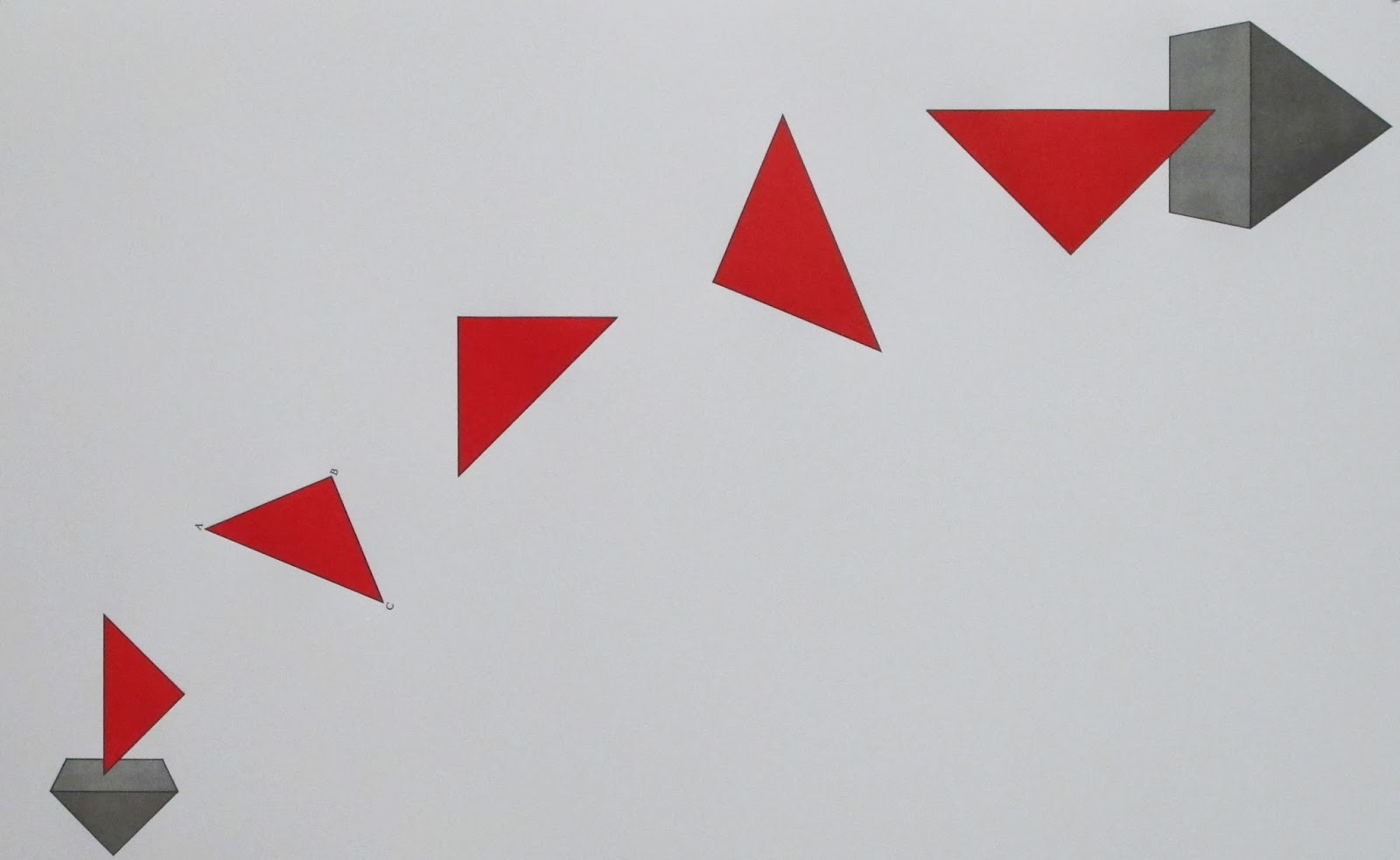
traditional diagram for this proposition is pictured below, five straight lines of ambiguous length, standing in for the measures and magnitudes. I get intellectual brain freeze when I stare at these diagrams. I understand them, even crave them, but they make me hurt for 
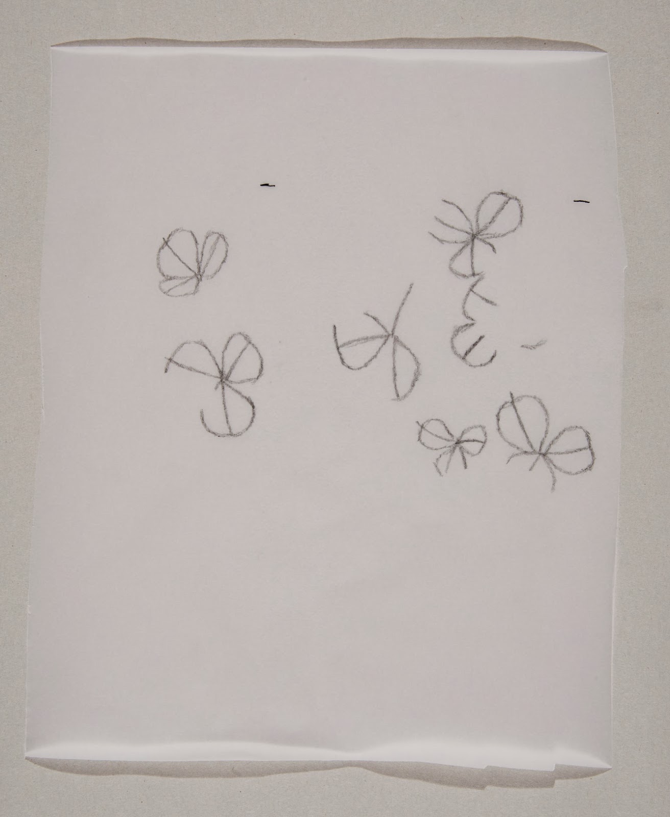
the pleasure. Below the traditional diagram is an image of my sketched proof which I think is an accurate portrait of how my mind deals with these problems. I assign value and build the square, both of which go against the Euclidean grain.

* * * * * * * * * * * * * * *

On other fronts, Travis Becker from Twinrocker Handmade Paper sent me a sample making of paper for the deluxe edition of Interstices & Intersections. He was trying to make a paper using cotton rag and abaca fibers that would approximate a linen and cotton paper I made with Mina Takahashi last year. The results were beautiful. Yesterday I proofed a variety of plates to test line quality and paper stretch and the sheets performed perfectly. In a few weeks Travis will begin work on the 800 sheets required for the deluxe copies.


The traditional diagram for Proposition x.10, using straight lines to represent number and magnitude.

My parsing of the proof using assigned values and forms.

Saturday, March 16, 2013

Alberti & Wittkower (& Euclid)

Through an idea that lead to a web search that lead to another web search that lead to an idea, I stumbled upon Rudolph Wittkower's wonderful book, Architectural Principles in the Age of Humanism. I wish I had found it sooner. Wittkower's ability to articulate the humanists' take on classical geometry is unparalleled and his extended discussion of the architectural symbolism of the circle is something I could read every day, aloud, like a chant. In the book's second part, Alberti's Approach to Antiquity in Architecture, Wittkower says of Alberti's first ecclesiastical architectural work, San Francesco in Rimini (aka Il Tempio Malatestiano):

To bury people under the arches of the exterior of a church was actually a mediaeval custom; examples are numerous and were well known to Alberti. The tombs planned for the façade and the side fronts of S. Francesco derive from such mediaeval models. But by placing sarcophagi with classically styled inscriptions under serene Roman arches Alberti created an impressive pantheon for heroes rather than a burial-ground with its traditional funereal associations.

If we parse Wittkower's paragraph, what he is actually saying is that the decisive difference between Alberti's first church and medieval ones is the style of lettering on the inscriptions, which effectively transform a graveyard into a pantheon. Medieval Italian churches abound with sarcophagi, or noted graves at least, under "serene Roman arches;" their choice of surface treatment differed from Alberti's but the over all architectural style is the same. The lettering on S. Francesco provides the transfigurative graphic content of the work, elevating an earthy medieval model to the reserved example of a new style.

From the standpoint of lettering history, San Francesco figures prominently in the (endless, tiring) debate over who in the Renaissance first made letters that approximated classical ones. Built as a vanity project for Sigismondo Malatesta in the 1450s and 60s, only the exterior of S. Francesco can be attributed to Alberti. Which is fine because the exterior is where all the faux classical lettering appears. The building itself, as Wittkower implies, only hints at Alberti's mature architectural vision, but the inscriptions are a clarion call for the coming generation. They place Alberti firmly in the company of Andrea Mantegna and Felice Feliciano, two other potential Adams in the creation myth of humanist lettering.

You may have guessed that I am not terribly interested in who first made classically inspired letters. History just doesn't happen that way. There is no Adam or, if there is, there is only one and he is long dead. Everything else is swept up in the zeitgeist of generational change. To suggest that the greatest architect of the Quattrocento borrowed ideas (from Vitruvius) and style (from the middle ages) but that he (or Mantegna or Feliciano for that matter) somehow produced ex nihilo the lettering of the modern age is absurd. Further, to place such emphasis on the Patient X of a revival of a millennium-old lettering style is to discount the millennium of lettering that interposed the two exemplars. To disassociate Alberti's inscriptions on San Fracnesco from medieval examples such as those on the Duomo of Salerno (1081), Santi Giovanni e Paolo al Celio (1150s), or San Giorgio in Velabro (first half of the 13th century) is to miss out on the true grist of creation: the friction and dialogue between generations, the revival and rejection that defines and energizes new styles.

Somehow, this relates to Euclid.

Thursday, March 7, 2013

Book V, Book V

I have spent the day working through the propositions in Book V of Euclid's The Elements. Augustus De Morgan says of the book's opening propositions that they are "simple propositions of concrete arithmetic, covered in language which makes them unintelligible to modern ears. The first, for instance, states no more than that ten acres and ten roods make ten times as much as one acre and one rood." To give you an idea of what De Morgan means by the book's unintelligible language, here is Heath's translation of the enunciation of Proposition V.1 If there be any number of magnitudes whatever which are, respectively, equimultiples of any magnitudes equal in multitude, then, whatever multiple one of the magnitudes is of one, that multiple also will all be of all. Once you sit down with the diagram and the text of the proof, these propositions are easy to work through. They are, after all, just as simple as De Morgan says. But the enunciations of the book's twenty-five propositions—the opening bits of text that tell you what the proposition is setting out to prove—are just as opaque as that of the first.

Among historic editions of Euclid, the illustrated printings are most famous but there were many beautiful editions printed in the Renaissance that contained only the enunciations—no diagrams, no proofs or conclusions. Antonio Blado printed at least two such editions, one in Greek, one in Latin. (Blado had a penchant for printing lists; the lists of banned books that he printed for the Vatican are models of typographic ingenuity.) Blado's Euclids are exquisite little pocket books, indispensable calling cards for the cosmopolitan humanist. One can only imagine the excruciating difficulty by which these books were attended. Imagine sitting down at your desk and trying to parse a proof for the proposition I quoted above, using only the enunciation. It makes me wonder how many owners of Blado's books pitched themselves head first out of their library windows in frustration.

The enunciations are not impossible to parse, of course, and once you immerse yourself in the language of Euclid his obscure geo-babble shines with an eerie legibility; but they are meant to be illustrated—by their readers if not by their printers. The diagrams that accompany each proposition are not illustrations, they are text. To properly understand Euclid you have to draw them. This singular quality of The Elements, that it is a text equally reliant upon image and language, sets it apart as a model for the contemporary artist book.

Friday, March 1, 2013

Interstices & Intersections in Progress

It has been a busy week of working on Interstices & Intersections. On Monday, 5,000 sheets of paper for the standard edition (all 1,320lbs worth) arrived from Germany, filling every available shelf and the entire surface of one of my two work tables. This morning Travis Becker at Twinrocker Handmade Paper made the first trial batch of paper for the deluxe edition. Travis is trying to create a paper that has similar qualities to one I made with Mina Takahashi on her farm last Spring. Between these two paper events I have been steadily working my way through the 115 proofs of the first four books of Euclid—drawing each proof, writing the Euclidean enunciation beneath it, and painting a title page for each volume of my Euclid notebooks as I go. I have settled on which proposition I will annotate from each of the first four books. Only 325 more proofs to go before all thirteen propositions are chosen.

The title pages for the first four volumes of my Euclid notebook, spread out on 1,000 of Zerkall paper.

Friday, February 22, 2013

Back from CODEX, Back to Work

After another exhilarating CODEX International Book Fair & Symposium, I am slowly easing back into the studio. 4,000 of the 5,000 sheets of paper for the standard edition of Interstices & Intersections arrive on Monday and I am continuing with the drawing of all 450 of Euclid's proofs. For this purpose I have had pale gray graphs printed on 90lb watercolor paper. I will be drawing the proofs in four page imposition so that they can eventually be bound into 13 volumes for easy reference. Here's a look at the loose title page of volume one.


Sunday, January 13, 2013

Interstices & Intersections

In the frantic run-up to the CODEX Book Fair and Symposium, I have been proofing some early spreads from my upcoming Euclid book. In the process I have been tossing around some possible title ideas. Serious contenders thus far have been "Therefore Etc.," "Extreme and Mean," "Syllogisms," and "Euclid Avenue." For the time being I have settled on: Interstices & Intersections or, An Autodidact Comprehends a Cube. Below are samples of what I have done so far, representing Propositions i.19; iii.1; iv.6; and xiii.17. (The large blank spaces are where as-yet-unwritten text will go.) Keep in mind that these are early proofs from a project that has another year, at least, yet in the making, so anything is open to change during that time. Tomorrow I will bring the sheets up to Daniel Kelm in Easthampton, Massachusetts so that he can bind a mock-up for the fair.