The first copy of Interstices & Intersections arrived on Sunday from Daniel Kelm. We shot a short video of the book in motion. The cover materials are calfskin (blue) and Tim Barrett's UICB Paper Case (gray) with a white line printed letterpress. Below are two photos of the book standing still.
Friday, March 7, 2014
First copy of Interstices & Intersections in motion
The first copy of Interstices & Intersections arrived on Sunday from Daniel Kelm. We shot a short video of the book in motion. The cover materials are calfskin (blue) and Tim Barrett's UICB Paper Case (gray) with a white line printed letterpress. Below are two photos of the book standing still.
Friday, February 14, 2014
Interstices & Intersections: Printing Complete!
On Wednesday, February 6, I finished the last press run of Interstices & Intersections or, An Autodidact Comprehends a Cube.
At final count, the book's thirty spreads required 225 press runs.
During the last month of printing, my assistant Nancy began preparing
any finished sheets for binding while I was chained to the press. The
binding is a double sided leperello accordion structure that requires
dry adhesive to be tacked onto the foredge of every sheet before the
books can be assembled. This is an extremely laborious process and it
would have delayed the binding by weeks if we had had to do it after all
the printing was completed. Instead, by having Nancy prep the sheets
while I finished the printing, we were able to collate the books the day
after I completed the last press run. Nancy has now been joined by
another helper, Katrina Kiapos, and they will spend the rest of the
month finishing the prep work while I bask in a languorous state of
unfettered leisure.
On Saturday, Annie & I drove the first batch of sheets up to Daniel Kelm's Wide Awake Garage bindery in Easthampton, Mass. After a tour of Daniel's chemistry book and apparatus collection, we were joined by his wife Greta. The four of us stopped by a local ice harvest before heading to lunch.
The finished book hung on the studio wall.
Collating the first twenty-six copies.
The oysters at Keen's Chophouse where Nancy, Annie & I had our Friday wrap party.
Standing outside the Cottage Street studios, home of the Wide Awake Garage.
Daniel in his chemistry library.
Havesting ice from the local pond above, tools for said harvesting below.
Sunday, January 19, 2014
Interstices & Intersections: the last month of printing
I have now entered the last few weeks of printing on Interstices & Intersections. As I finish up the final thirty press runs, Nancy will begin preparing the sheets for delivery to bookbinder Daniel Kelm at the Wide Awake Garage.
Daniel came down for a visit this past week to show samples of the
custom dyed goatskin we ordered for the standard binding, and to choose the seven skins needed for the leather inlays in the deluxe binding.
The book thus far hanging on the studio wall.
An assortment of mixed inks and dry pigments in the inking theater.
A proof of the seven color illustration for proposition xi.38.
The illustration being editioned.
Painting the designs for the deluxe binding.
The finished binding designs. The color in the binding will be different but the shapes are accurate.
Looking at the goatskin samples with Daniel Kelm.
The book thus far hanging on the studio wall.
An assortment of mixed inks and dry pigments in the inking theater.
A proof of the seven color illustration for proposition xi.38.
The illustration being editioned.
Painting the designs for the deluxe binding.
The finished binding designs. The color in the binding will be different but the shapes are accurate.
Looking at the goatskin samples with Daniel Kelm.
Monday, December 9, 2013
Interstices & Intersections: Cube Design for Euclid's Proposition viii.15
Last week I finally finished printing the twelve color design for proposition viii.15 from Interstices & Intersections.
The print bleeds off three sides of the sheet and covers a total area
of 11 x 13.5 inches. Ten of the plates register across the entire area, a
fact that has been tormenting me since I first painted the design back
in April. I have never tried to register two colors over so large
an area, the thought of ten froze me in my tracks. I procrastinated for
months before finally re-drawing the design in separation. Even then I
tried to cut corners. In the lead up to printing I tried everything I
could to find a more expedient approach to the printing, fooling myself
for a couple of months that I would be able to get away with a mere six
plates/colors. I would mix and remix colors but every proof looked flat
and lifeless. When compared to the original painting the proofs were
completely discouraging. My solution was to draw a series of pencil
drawings that would be printed over the flat areas of color. I began by
printing the outline in a purply black and the four principal flat
colors in subtle tones of hand-ground inks: Venetian red, Bohemian green
earth, yellow ochre, and burnt umber. I then printed the pencil
drawings on top of these in darker inks of a slightly different hue.
After these nine plates the white tops of the cubes took on an
unsettling fluorescence which I toned down with a subtle cream, before
filling in the center gray background with a warm putty overlaid with a
bluish gray.
The original watercolor painting.
One of the six color proofs.
The final twelve color print.
A video of the state and progressive proofs leading to the final print.
Thursday, October 17, 2013
Clover image from Interstices & Intersections
In the run-up to the Oxford Fine Press Fair on November 2 and 3, I have been working flat out to have as much of Interstices & Intersections
printed (or proofed) for a new mock-up to show at the fair. The
schedule has made blogging nearly impossible. At the end of the day I'm
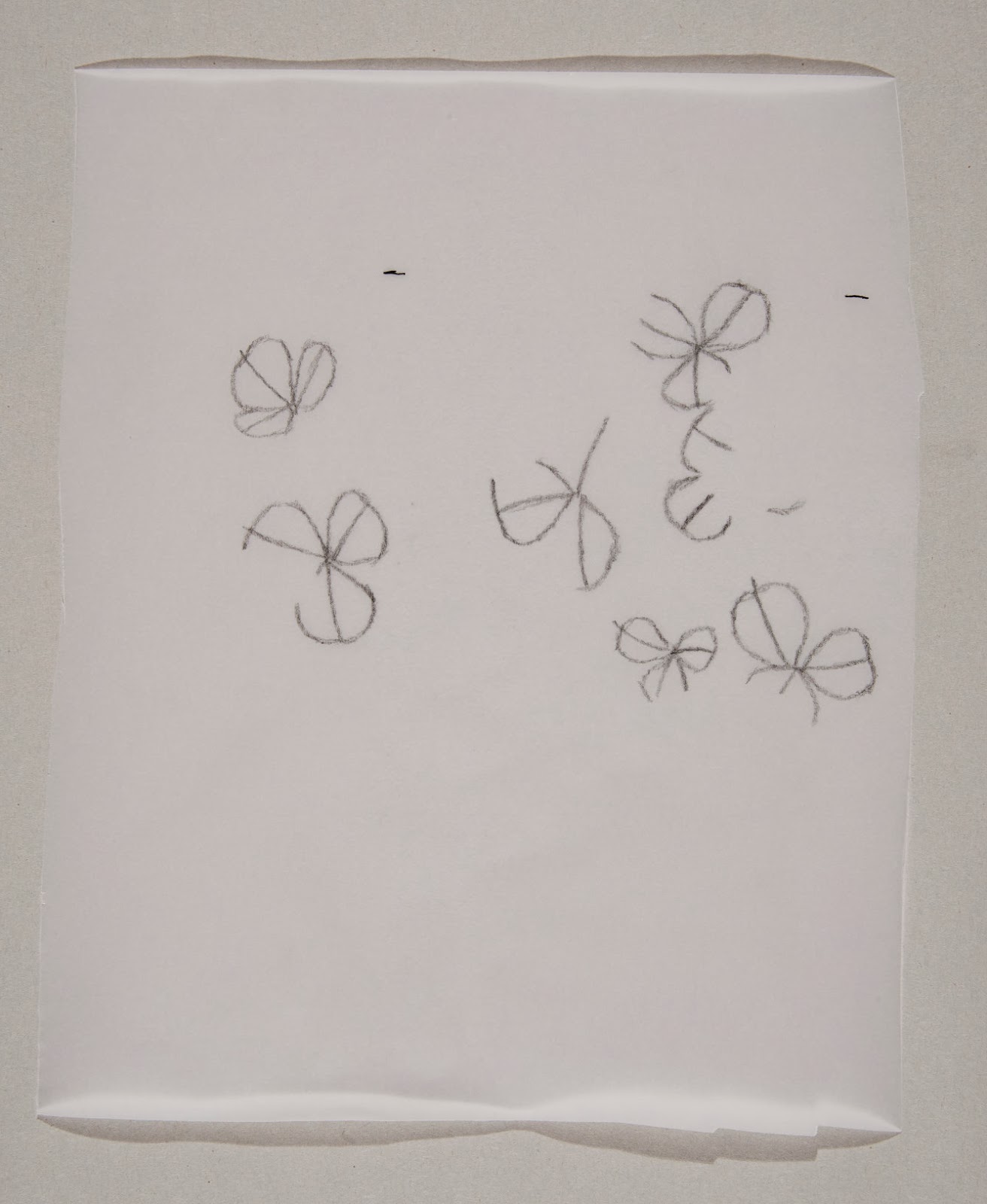
simply too tired to reflect and write about my process. With the dummy sheets finally off to Daniel Kelm for binding the mock-up, Annie came by the studio yesterday and photographed every state and progressive proof to date, as well as the proofed images for the dummy. I'll write about a few more of the images over the next few weeks but in the meantime I'll just deal with the clover image from Proposition 6.30.
I begin by drawing an outline of my clover patch in pencil and then scanning and re-drawing it in outline in Illustrator.
I then divide the clover petals into four different densities
Creating four levels within the image
I then draw highlights for each level in separation
Re-combining and inverting them digitally
Producing a plate that prints as so
I then create a four-tiered shadow that I print in a gray made of equal parts orange and black
For the final image below
Tuesday, October 8, 2013
Printing, printing
For the last two months I have been printing all out, cranking the
Vandercook 5,000-7,000 times a week, trying to keep ahead of the curve
on Interstices & Intersections. The first big deadline is approaching, The Oxford Fine Press Book Fair, and all of my energy has been geared toward preparing as complete a dummy of the book as possible to show at the fair. The schedule has been so tiring that it has been hard to take a moment and write clear-headed blog entries,
a task I am still not up to. After I send the dummy sheets to the binder next
week, though, I'll sift through all of the process photos and put
together a more interesting post. In the meantime, here's a photo of the
first text plates. I'll never tire of the seeing the transformation
that text enacts on a page.
Sunday, September 1, 2013
The First Month of Printing Interstices & Intersections
After a bit
of a rocky start setting up, life in the studio is now moving at a
steady pace. The day begins with a 7.5 mile bike ride downtown, over the
Williamsburg Bridge, and on to the studio on Flushing Avenue, where I
print for seven or eight hours, and then turn around and bike back home.
As it stands now, my intention is to print for one month stretches,
followed by a week of drawing and writing at home in preparation for the
next month of printing. These breaks in the schedule are critical. By
the end of the month, the print work begins to feel more like drudgery
than creativity, and the prospect of being at my drawing table at home
fills me with nostalgia. Once home, I throw myself into the chaos of
tracing paper, tape, pencils, and pens that my table quickly becomes
until, after a week or so, I get antsy to proof what I have done, to see
if the colors of my separations work together on paper the way they do
in mind (they rarely do). Even though I paint and draw more than I used
to do, I still do not consider an image complete until it is printed.
This casts my drawings in an interesting light—until they are printed
my drawings are purely hypothetical, they are propositions for prints
that often do not work in practice. When they do work, the process
begins again and all I can do is print, print, print.
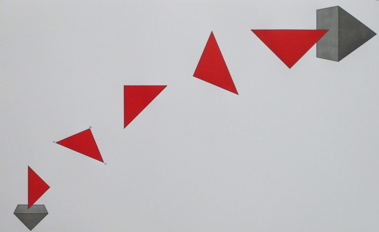
My approach to the book is to print the images first and the text last. I always prefer to print the most difficult thing first, in case of error there is less to reprint. I also want to give the text the most time to rest and germinate before committing it to paper. In the end, I am more confident in my ability to draw a triangle than I am in my ability to describe what that triangle means to me. All of the spreads pictured below are therefore lacking a critical element: the words. Without the words, many of the spreads can seem disjointed and out of place among one another. The images on them are just images and the key to their understanding is contained in the text. That text, in turn, is composed of thirteen shorter texts which are themselves each related to a book of Euclid's The Elements. So when looking at the photos below, try to imagine text where all of the large white spaces are. Some of it is shaped in unexpected ways, some in the way you might expect.
This
is the opening spread of the book, for proposition i.19. Although it
looks simple, the image required eighteen cranks of the press to achieve
the thickly layered colors (the red is actually four coats of ink, two
of solid red with two scumbles of yellow on top).
This
comparatively pale image follows it, a five color rendition of a sheet
of loose leaf paper showing the folding diagram for a paper football.
The opening spread for proposition iii.1 so far has six impressions (both the blue and yellow are double hit).
The
second spread for iii.1 with six of the ten plates that will eventually
be required. Many of the subtleties are lost in the digital
reproduction but the blue ink on the basketweave is a particularly
satisfying periwinkle color made from hand ground ultramarine deep and
cobalt blue pigments.
The second spread for proposition iv.6 is printed with five plates using hand ground raw umber inks.
The second spread for proposition vi.30 with eight of the ten or eleven plates that will eventually be used.
The final spread of the book, two renderings of the dodecahedron for proposition xiii.17, comprising thirteen plates.
Subscribe to:
Posts (Atom)