Sunday, January 31, 2016

Some Problems with Red


A couple of weeks ago I began printing a new book called Some Problems with Red encountered by Russell Maret while daydreaming in his studio and here explored with the aid of multichromatic letterpress. The book consists of five short texts dealing with the difficulties of describing and reproducing color, each of which is paired with an illustration. As suggested by the title, the book is a whimsical project that grew out of my "General Color Theory" from Æthelwold Etc., and continues my recent exploration of alternatives to the photo-polymer image making techniques that I have been using for the last eight years. Four of the five illustrations are printed from linoleum, end-grain maple, or metal type ornaments, while the fifth is drawn in ink with a compass. I should be done with the printing by the end of February, with the book debuting at the Manhattan Fine Press Book Fair on April 9.

Like many of my texts, the core of Some Problems with Red was written on envelopes and napkins after waking up in the middle of the night. Below is the initial draft of the first text in the book, dearly in need of editing.


The text is hand set in Stymie Medium, a typeface that in the best circumstances is difficult to use. Its letterforms are wonderfully open and diverse—with a sizable compliment of alternate characters—but the typeface requires a considerable amount of massaging to bring out its letters' best qualities. The eccentric frankness that attracted me to Stymie easily transforms into a kind of dullard's scribbling if handled indelicately, so, despite the brevity of the text, I spent a couple of months proofing, editing, shifting, mitering, and mortising before going to press.

Below is a close up showing characters to be replaced with mortised pairs (circled) and word spacing to be adjusted. (The text correction was thrown out in place of a different solution.)

Each new section begins with a pilcrow, each of which is elevated one point for better alignment with the Stymie.


The text and images are printed on Zerkall Litho 270gm, a paper whose surface undergoes a remarkable transformation after it is dampened and dried, becoming much less smooth and more accepting of ink. Below left is a stack drying between blotters, while on right a stack is being dampened.


Once ready to print I assemble an imposition dummy of the book containing all pertinent information for printing. Each sheet is marked with the signature in which it appears (A=Signature 1; B=Signature 2, etc), its placement within that signature (A1, A2, etc), its page number (the circled numbers), whether it is printed on the felt or screen side of the sheet (F or S), what text or image gets printed on which page ("Websters", "Red", "Two Source Text", etc), which press it will be printed on (the Vandercook Universal III or the FAG Control 405), and then slashed through and dated when it is printed.


Both the FAG Control 405 and Vandercook Universal III are hand operated flatbed cylinder presses. I print metal type on my FAG.


And I print blocks and plates on my Vandercook.


Once the imposition dummy is made, the paper dampened and dried, the text re-read and proofed one last time, I begin printing. The first task of the first press run is to establish the "black master," the ideal example of what I want every page of type to look like. Throughout the printing of a book this master is often fiercely interrogated and questioned—one day it looks perfect, the next it looks terrible—, but despite the daily vagaries of vision, the master stays out on the table until the book is done.


A similar process of color control is undertaken with color prints, but there is a little more latitude because there is no instance in which a color is repeated in the book. I still work very hard to keep color consistency throughout a press run—I want all of my orange pages to look like the same orange, for instance—but with large areas of color I usually choose a selection of slightly varying prints as my "acceptable range" rather than having one single master. This is particularly important with large solid areas because the color of the ink changes dramatically as it dries. If a press run lasts four hours, your initial master will have changed color simply because the ink has dried during the process of the run, and freshly printed sheets that might be the same color as your master will look different until a similar amount of time has elapsed. Which brings me to why I wrote the book in the first place.


Saturday, October 10, 2015

Details from Linear A to Linear Z

Here is a selection of photos of details from Linear A to Linear Z.

 Title page set in Pilot Black Italic and Gill Sans.

 The letter F.

 The letter G.

 The letter J.

 The letter M.

The letter O.

 The letter P.

The letter S.

 The letter U.

 The block and print of the letter X..

 The prospectus on press.

 The binding in process.

 Spine detail of the first six copies.

Monday, August 31, 2015

Announcing a new book: Linear A to Linear Z

Last autumn I found myself daydreaming about lines. This was not terribly surprising—I had spent the previous few years concentrating on color to the near exclusion of line—but it felt unusual in that it was such a sharp break in my thinking. There was no color involved in my fantasies, all of my dreamed lines were black and white. Specifically I was thinking about letterforms composed of intersecting horizontal and vertical lines, and in my off hours I made some digitally drawn experiments: a bifolium for the Codex Foundation's publication, Alchimie du Verbe, and my MMXV new year's card. The results were satisfying, particularly the Alchimie du Verbe print, but they did not quite capture what I had in mind. The lines that I wanted were neither digital nor were they black. Instead, I kept imagining white lines hand cut from a black surface, and a printed book of the blocks titled Linear A to Z. I chose 4 x 6 inch linoleum blocks as the ideal proportion and medium, and I began making thumbnail sketches, always stalling at certain key letters that seemed to resist the linearity, or the proportion, or both.

Detail of Alchimie du Verbe print.

Quick thumbnail sketches of linear letterforms.

Full scale sketch of linear Q from Linear A to Linear Z.

 The Q block in process.

A few months later I began sketching the letterforms at actual size, working through the alphabet fairly quickly with the exception of those same obstinate letters. During the process I found myself wanting to use an awl to make circular dot marks in a block. My mind revolted against the thought. No, no, you can't do that! This is an alphabet of lines! This resistance to intuition after a system has been developed is the most challenging hurdle in designing an alphabet, particularly when the alphabet is based so clearly on geometric forms. In every geometric alphabet I have drawn there has been a similar moment of reckoning, a crescendo of head-banging-against-wall until the wall finally breaks, and the rigid geometric system is either loosened or abandoned all together. Despite their gathering into a seemingly homogeneous alphabetical group, letterforms are diverse. They have individual histories, potentials, and, on a basic level, they have different parts: horizontals/verticals, diagonals, and curves. Different letters need to be approached differently.

As if to prove the point, the first block I cut of my linear alphabet was an O composed of hundreds of tiny round dots, with nary a line in sight. Eventually I settled on three kinds of marks that gave me enough flexibility to produce the twenty-six letterforms: the line; the dot; and the wedge (a cuneiform-like mark made by driving a V-shaped cutting tool deeper into the block). For some letters these marks are used in ways that might be expected—the dot for the O, the line for the L, etc. For others they are not. In any case, the use of these different marks required a re-visiting of the title. Linear A to Z implied that all of the letters were composed of lines, which was no longer true. Linear A to Linear Z, on the other hand, described the marks used to make the A and Z while leaving room for the intermediary letters to be constructed by other means.

Detail of lines used on the A block.

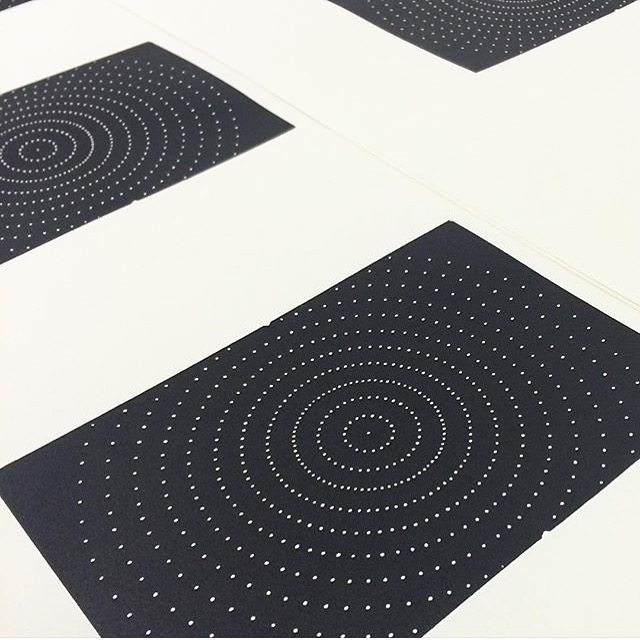
Detail of dot marks used on the F block.

Detail of wedge marks used on the X block.

Linear A is the earliest known Aegean script, discovered by Sir Arthur Evans while excavating in Crete in 1900. Used by the Minoans in the early second millenium BCE, Linear A shares many characters in common with the later Linear B script of the Mycenaeans but, unlike Linear B, Linear A remains undeciphered. As the Mycenaeans succeeded the Minoans as the region's dominant culture, it is not too great a stretch to search for a link between the two scripts, but attempts to apply character values from Linear B to the same characters in Linear A results in gibberish. That a familiar form can have multiple meanings, or be legible in one instance and inaccessible in another, strikes me as an illuminating insight into the struggle of mark making in general, and letter design in particular. It is also a model for the letterforms I designed for the book, which are not intended to be immediately recognizable as the A, B, Cs we commonly use, but as forms and shapes that evoke the twenty-six Roman capitals. They are meant to be A, B, Cs that can also be something else entirely.

Friday, April 3, 2015

Broadside for Parenthesis 29

I spent part of this week printing a broadside for the deluxe copies of Parenthesis 29, the Fine Press Book Association's semi-annual journal. The print gave me the opportunity to finally work with the fonts of Aleksandra Samulenkova's Pilot typeface that I have been hoarding for the last couple of years. Pilot won the titling face category in the FPBA's 2013 Student Type Design Competition and, as part of the prize, the face was engraved and cast as a new metal typeface by Ed Rayher at Swamp Press & Typefoundry.


In addition to its dynamic letterforms, the typeface is distinguished by an extremely tight fit; qualities that together result in an unusual urgency for such a bold face. The letters practically stumble over each other trying to get to the next word.


To maintain this tight fit, Ed had to cast the type so that nearly every character kerns off the side of it's body. This makes the casting and the setting of the type a little more challenging than usual, but the results are well worth the effort. 
 

If you would like a copy of the broadside, join the FPBA at the deluxe level. To order fonts of the type, contact Ed Rayher at Swamp Press.

Monday, December 15, 2014

A New Type for Hungry Bibliophiles

Pre-Industrial text pages are often described as being alive, full of movement and sparkle that is rarely seen in pages set in post-Industrial typefaces. The most obvious source of this liveliness is technological: every letter was hand engraved, hand cast, hand inked, and hand printed, resulting in unavoidable imperfections and variations. In addition to these technological determinants, most printers had typefaces that contained alternate or out of place letters in their character sets. Rather than a single Q or g, a printer would have two or three or more designs of certain letters and, as they set their pages, would pick and choose among these variant forms, either by preference, accident, or necessity. Any given letter, in other words, was understood to have many potential permutations, and their intermingling on the page added a further element of typographic surprise.

Various uses of the two "g" forms in De le Lettere Nuovamente Aggiunte Libro di Adriano Franci da Siena, printed by Lodovico Vicentino & Lautizio Perugino, Roma, 1525.

Beyond these sources of typographic variability lies another factor, one that would best fit under the rubric of commerce. Historically, most printers have purchased, rather than designed, the typefaces they used. In the pre-digital world, this meant that printers would acquire matrices or punches from a designer or agent, and use these tools to cast type in their own shop. When, as invariably happened, one or more of these tools broke, pre-Industrial printers would rely on local craftspeople to cut replacement letters. As these re-cut letters filtered into a printer's typecases, the formal qualities of the typeface changed in subtle but sudden ways, often occurring in the middle of a book or even a single page. Replacement punches, after all, were not typically commissioned in idle moments, but in a state of urgent necessity; they were cut when a printer ran out of, say, the letter "f" half way through the printing of a book, found that his matrix was worn out, and, when attempting to strike a new one, broke the punch. In a panic, a local punchcutter would be called, shown a model from which to cut a new punch, and the book could be finished and shipped off to market.* Speed, more than aesthetics, is the engine of such moments, and a workable letter quickly engraved trumped any aspirations to strict formal fidelity. I believe this element of speed, whether in the initial cutting or the recutting of letters, was critical to the feel of pre-Industrial pages.

Since I began designing type I have tried to find ways to recapture some of this pre-Industrial liveliness in my typefaces. Short of cutting my own punches or creating large sets of extra characters, I have found that speed is one aspect of historical type design in which I can partake without risking the wonky anachronism that often results from strict historical mimesis. I have also spent a lot of time attempting to redraw historical letterforms in an effort to tap into the gestalt of pre-Industrial letterforms, a pursuit that is frustratingly and consistently futile. If I redraw the same letter five times, I end up with five distinctly different letters, none of which looks quite like the original I was trying to imitate. At best I create a passable likeness. So when considering how to approach the type for Hungry Bibliophiles, I decided that I would put aside any pretensions of genetic accuracy and begin from the presumption that I am acting as a replacement punchcutter. In the spirit of Tim Barrett's experiments with high speed papermaking, I set myself a daily goal of between ten to thirty letters (as if that many punches had broken since I was last at work) and a speed of ten letters per hour, allowing myself only one drawing and one revision per letter.

As my model typeface I chose the Canon Roman and Italic of Peter de Walpergen that was acquired by Oxford University Press in 1686. I consciously chose a typeface that was neither Italian nor Renaissance in origin, one whose workaday forms would have sent Nicolaus Jenson leaping from the Ponte Rialto as if he were a corporeal bit of Doves type. The Dutch typefaces that Bishop Fell acquired for Oxford are full of irregularities—in weight, slope, stress, alignment, and spacing—, and they delight in unexpected pairings and ambiguities. They can be disconcerting in their proportions but they sparkle with life, as if they were coursed through with a dappling light. From a practical standpoint, De Walpergen's types also have a proportionally large x-height, making them eminently readable at a small size. His are typefaces that are ready-made to slog through the various trenches of partisan pamphleteering, Calvinistic tracts, and Uncle Pieter's kugel recipe. Perfect, in other words, for a book like Hungry Bibliophiles.
_______
*Printers who design and manufacture their own type, such as Vicentino and Perugino, would obviously have re-cut a broken punch themselves.


The first state of the type for Hungry Bibliophiles, based on the canon roman and italic of Peter de Walpergen. In the coming weeks the letter spacing will be adjusted but this gives a good sense of the letterforms and how they work together. The type will also look considerably different when printed letterpress, as it is designed to be.

Friday, December 5, 2014

Hungry Bibliophiles: An Experiment in Utilitarian Bookmaking

Over the last couple of years Tim Barrett and I have engaged in a conversation about the role of gelatin sizing in papermaking and printing. The central issue we have been discussing is this: sizing has a negative impact on print quality but a beneficial impact on the longevity and endurance of paper. Tim’s research into 15th and 16th century European papermaking processes has suggested that some, and perhaps many, post-15th century books were printed on waterleaf (unsized) paper to which the books’ printers, or someone else, added sizing prior to binding. For those of us who use very expensive handmade paper to make even more expensive books, the thought of dipping our printed sheets into a vat of liquid gelatin is a ripe topic for contemplation on a dark night of the soul. Despite this, after our initial conversation I sent Tim some printed sheets from which I had removed the sizing so that he could re-size them. The results were intriguing but not entirely persuasive. Although the increased durability that sizing can lend to paper is appealing—books are meant to last beyond a single user or century—the books that I make are used in ways that are not comparable with those that a 16th century book had to endure. A contemporary press book that is printed on soft, unsized cotton paper, housed in a box, and stored inside a temperature-controlled vault will bear its age well. If the same paper had been used to print pocket books for traveling Humanists, the books would not have withstood the demands of their owners.

The repeated physical use to which many early printed books were subjected lent them a patina similar to that of well-used tools, full of shine and scuff. In addition to the frequency of opening or the method of storing their books, early modern bibliophiles differentiated themselves in one important way from their 21st century avatars: they wrote in their books. They wrote in the margins, between the lines, in the voids of woodcuts, on fly leaves and paste downs. They parsed, debated, excised, and amended their texts in ways that are unthinkable to contemporary private press printers, but that were certainly expected by the printers of the day. If the paper in their books had not been sized, the ink of their pens would have bled into the paper fibers rather than holding a crisp line. The expectation of marginalia was another determining factor in the sizing of book paper after printing. Just as it is today, use was the arbiter of process.

An example of ink bleed on paper that had its sizing washed off in a flood.

With many of these issues in mind, Tim Barrett and his students at the University of Iowa Center for the Book have been trying to recreate the working conditions of a pre-Industrial papermill, employing a three person team to make 100-200 sheets of handmade paper per hour. (A video of this process may be viewed here.) The paper is not meant to be perfect or precious but well-made and serviceable, to invite contact and annotation. With this paper, Tim and his colleagues are attempting an intriguing sleight of hand, engaging an historical process in the hope that it will arbitrate contemporary use. The problem, of course, is that once a craftsperson puts something out into the world, he/she cannot control how that object is used. It's all well and good to want people to use paper in a certain way, it's another matter altogether to get them to actually do it. Handmade paper, however quickly made, instills a certain amount of fear in bibliophiles. The speed with which it is made does not alter its perceived preciousness. The missing element is content.

In thinking about how to get people to use Tim's paper more aggressively, it occurred to me that I would have to make a book whose content would tilt the scales; a book that would encourage people to take the book off the shelf and into the messy world of their daily lives. No book satisfied this requirement better than a cookbook. In the hope of finding people who would be willing to put a fine book through the paces, I have invited a group of bibliophiles to submit one or two recipes each for a small cookbook. In turn, each participant has agreed to cook as many of the recipes in the book as they can within the space of a year, to cook them with the book on their counter top, and to take notes in ink on the pages of the book. At the end of the year Annie will photograph the books for a comparative digital catalogue and I will coordinate an exhibit of the used books. To fund the project I will print an edition of fifty additional copies for sale at a reasonable price.

The text will be set in a new typeface of mine (to be discussed in a future blog post) and printed on unsized sheets of UICB paper. Once printed, I will ship the sheets back to Iowa for sizing. Maria Fredericks, the Drue Heinz Book Conservator at the Morgan Library & Museum, has designed a paper binding typical of inexpensive book production in the European handpress period. A team of binders, overseen by Maria, will attempt a high-speed production process for the binding similar to the one that Tim uses for the paper. The book should be completed by summer 2015.

The Particpants
Walter Bachinsky & Janis Butler
Bob Baris & Freddy Scott
Timothy Barrett & Jodie Plumert
Carolee Campbell
Dan DeSimone
David Esslemont
Susan Filter & Peter Koch
Maria Fredericks
Paul Gehl & Rob Carlson
Ian Kahn & Suzanne Hamlin
Nancy Loeber
Russell Maret & Annie Schlechter
Robert & Margaret McCamant, Jack Croucher
Sandra & Harry Reese
Liv Rockefeller & Kenneth Shure
Frank Rothkamm & Nina Schneider
Sara Sauers & Mike Lewis-Beck
Gaylord Schanilec
Richard Seibert
Jane & Cary Siegel
Mina Takahashi & Marco Breuer

Wednesday, November 12, 2014

A Sabbatical of Sorts

From left to right: the deluxe and standard copies of Pressed for Time (2014), Specimens of Diverse Characters (2011), Æthelwold Etc (2009), and Interstices & Intersections (2014); Prometheus Bound (2007); A Meditation in Rome (2012); Pervigilium Veneris (2009); Mediæval In Padua (2008); Nocturnes (2011); Book of Jonah (2012); Floating Overhead (2007); A Showing of New Foundry Type (2011); The Blog of Specimens (2012); Visionaries & Fanatics (2010); and A Roman Inscription (2010).

It has been a busy seven years. Since 2007 I have completed fifteen books and, with the publication of Pressed for Time, it feels like the right moment to slow down for a while. My recent "big" books have gotten progressively bigger, and the exhaustion of producing them is beginning to wear on me. But exhaustion is not the primary motivation for the sabbatical. Since printing Æthelwold Etc in 2009, I have been developing a very specific technique of multichromatic printing using photopolymer plates. With the publication of Interstices & Intersections earlier this year, I feel that I have taken that technique as far as I can (for now). Making books only remains interesting for me if their making is a process of learning, and I fear that, if I continue working in the same manner as I have been, I will fall into rote production. It is time for the polymer color printing to transition from raison d'être to its new position in the toolbox beside the other tools that are available to me. So what better solution than to spend a year experimenting? 

My plan is not to stop working but to work differently, with one pulsing neon mantra beaming above all else: NO DEADLINES! I intend to spend most of my time sketching but there are two small projects that are certain. The first is a collaborative cookbook, Hungry Bibliophiles, which is meant to test some of Timothy Barrett's ideas about durability and "authenticity" in handmade paper. I have received the paper from Tim and am almost done designing the typefaces in which I will print the book. I will post more information about the book when I am closer to printing. The other project I have lined up is the engraving and casting of a new metal titling face and ornament suite. The type will be produced by Ed Rayher at Swamp Press and will result in a small specimen when complete. (The ornament is a twelve piece, two color combination ornament.) Ed has engraved a sample matrix and everything looked good, so I should receive the finished type sometime in January. 

As I work I will post regular photos on the blog accompanied by varying amounts of text.