Character Traits
provoked another significant realization about how my lettering and
type design relate to the content of my books. Historically, my
lettering has been divided into two distinct categories: large,
interpretative letterforms on one hand, and proper, constrained
typefaces on the other. For over twenty years I have tried
unsuccessfully to find ways for these two alphabetical impulses to merge
into some hybrid form. What Character Traits taught me was that
it was not the lettering that was preventing me from doing this, rather
it was the content of my books. The template I had been using in my work
was to isolate my interpretative or abstract letterforms on single
pages, and then write notes about them in my more traditional typefaces.
In order to merge my two lettering impulses, I had to move on from this
approach and change the content of my work.
With all of these ideas swirling in the background I began work on a new book project called Three Constitutions. The book was inspired by the increasingly contentious conflict between "originalists," those who view the Constitution as a prescriptive cultural artifact delineating American "civilization," and those who view the Constitution as a flexible instrument conceived to adapt to the evolving political and social realities of American "nationhood." This is a conflict we are all familiar with, but what got me started working on Three Constitutions was that in the blaring echo chamber of the hourly news cycle, the originalists were, and are, dominating the discussion.
The problem with these zealous, self-described Constitutional "patriots" is not dissimilar from that of religious zealots: if (and it's a big IF) they have bothered to read their primary document—the Constitution or whatever their holy book happens to be—they have done so through self-justifying blinders. How many Constitutional "originalists," for instance concentrate on the fact that the fourth phrase of the preamble is to "insure domestic Tranquility" or that the sixth is to "promote the general Welfare?" How many self-proclaimed "Proud Boys" understand that the second amendment is an amendment, and therefore provides its own justification for being revisited and amended further? The more likely scenario is that these originalists have not read the original documents at all. Instead they encounter the Constitution at a remove by relying upon the interpretation of others for their beliefs.
The idea that developed from these musings was to print the Constitution in three ways. One large volume would contain the actual text, but it would be printed in a typeface that is difficult, though not impossible, to read. This volume would be accompanied by two smaller volumes, each of which presented an interpretation of the original text. In thinking about the primary contemporary means of doctrinal interpretation, it struck me that there are two: 1) party apparatchiks (President, senators, media commentators, communities, churches, etc) and 2) the internet/social media. One's party interprets by lopsided emphasis and redaction, resulting in an edited version that fits their political aims. The internet interprets by algorithm—providing you with either a best guess version of what someone like you (or who the algorithm assumes you are) would want to hear, or a version that is determined by the limitations, or motives, of the person who conceived the algorithm.
For the redacted version, I had the full text of the Constitution and Amendments set in my Hungry Dutch type. I then went through the text and highlighted key words or phrases to be redacted by physically turning the type upside down. These inverted pieces of type print as black rectangles, resulting in pages that look similar to how redacted government documents look.
For the internet version, I fed the original text through a series of translations using Google Translate. It was first translated into Esperanto, as an expression of the Utopian ideals behind the text and the language. From Esperanto, the text was then translated into Russian, from Russian to Chinese, and Chinese back to English. The resulting text is something like the original, but different in subtle yet meaningful ways. For this volume I designed a typeface that feels very much like a digital design, using simple geometric forms.
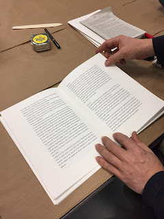
In the beginning of November my former student Sarah Moody moved in with us to work on the project. Since then we have finished the internet volume and are currently printing the redacted version. Later in the month we'll begin work on the larger volume. Below are a selection of photos of the process so far, mainly taken by Sarah.


