Thursday, March 10, 2011

Iohann Titling Continued

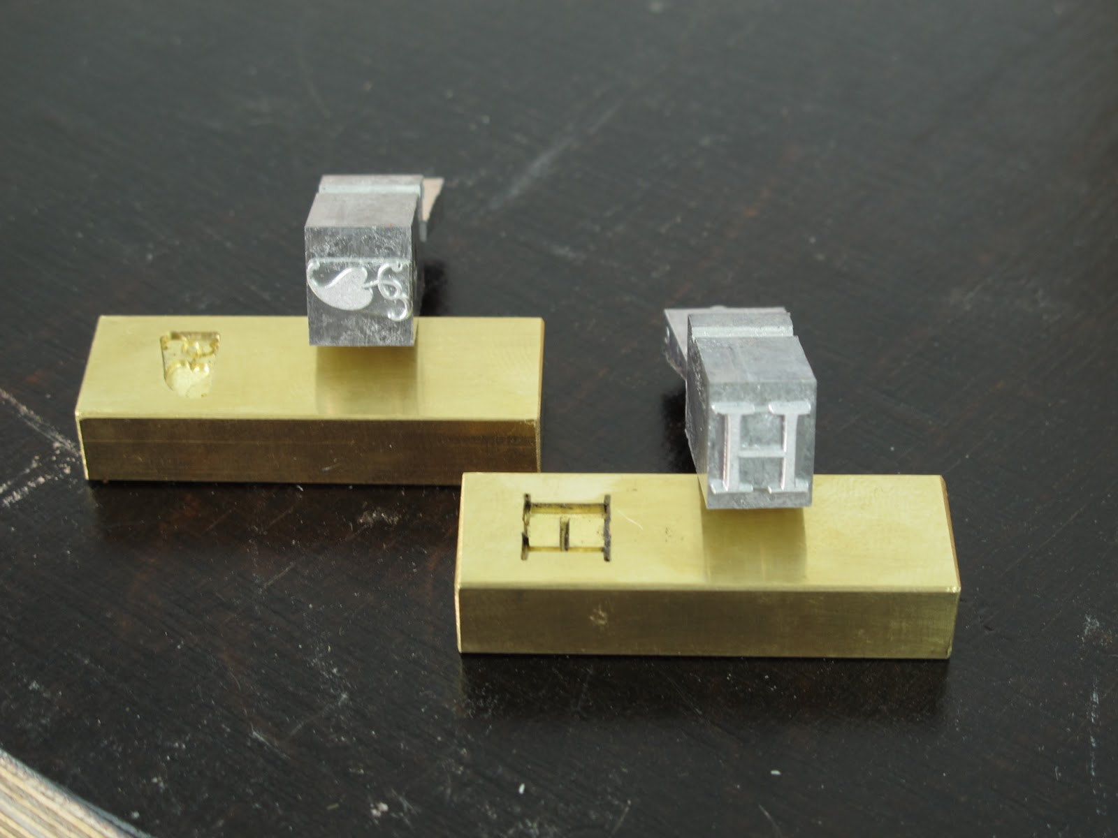
The Iohann Titling H and leaf matrices with castings

Yesterday, Micah Currier pulled a couple of proofs of the H and leaf ornament from the first casting of Iohann Titling. Now that he has established the correct height parallel, we have to make sure there is no stem distortion before he cuts the remaining matrices. According to Theo Rehak, there is a possible width distortion of up to 10% in either direction when the image is translated from pattern to matrix on the Benton Engraver. After scanning Micah's proof in to my computer I overlaid the original drawing for the H to find that there was considerable condensation of the letter form. This weekend, Micah will correct the distortion and re-cut the matrix.

The proof of the H with my original drawing overlaid on top of it

Tuesday, February 22, 2011

Specimens: Making Iohann Titling

Last Friday, Micah Currier of the Dale Guild Type Foundry picked me up for our first day of work on Iohann Titling, the type that Micah will be cutting and casting for Specimens. The day started with a stop by Globe Engraving to pick up a sample pattern for cutting the matrices on the Guild's Benton Pantograph Engraver. After a couple hours at Globe we came away with a well made pattern and headed down to Howell to begin work setting up the pantograph. After a thoroughly enjoyable afternoon that included some complex mathematics and Theo Rehak playing the trumpet in the background, Micah got the Benton set up to cut the first sample matrices. He will cast the first sample characters this coming weekend.
Micah Currier locking a brass planchet into position for cutting.


Micah operating the Benton Engraver.


A tracing of the Iohann H made with the engraver.


The Thomas Edison vintage microscope used for measuring the height parallel of the engraving.

Friday, January 21, 2011

Announcing a forthcoming publication: Specimens

The type specimen is a curious hybrid in the history of the book. Born of a base necessity—the need to sell type—the specimen quickly took on a life of its own and fulfilled a parallel need to delight and entertain. Part portfolio, part brag sheet, the type specimen allows the designer to present the best-case scenario for a specific typeface, to show off its finer aspects while presenting an ideal method of use. In this way, the type specimen is flight of fancy and style manual combined, an exercise in utility heightened and illuminated by extravagance. Some of the more elaborate type specimens, like those of William H. Page and Co., are suffused with a playful futility, a special knowledge that, once sold, the types displayed will never be treated with the same reverence or care. But all type specimens, to some degree, are conceived in that rare instance in which commerce plays second fiddle to imagination, when the demands of industry and utility enhance, rather than diminish, the expression of a creative impulse. 
    When cast in this light, SPECIMENS is more accurately an exhibition than a type specimen. The alphabets displayed in it are not for sale. Instead, they were designed for proprietary use, often with specific texts or authors in mind; they were designed, in other words, to only be used in their ideal settings. While borrowing the form and the guise of the type specimen, the motivation, the book’s raison d’être, is to be an object in its own right, rather than a catalogue of typographic widgets. 
    The alphabets in SPECIMENS, the texts in which they are displayed, the method by which they are printed are all integral parts of a kaleidoscopic portrait. Composed of three sections, SPECIMENS opens with a multi-chromatic display of short texts set in a variety of styles. Following this, a selection of alphabets are displayed in lengthier texts appropriate to their forms: Baskerville’s Great Primer is displayed in a chapter from Candide; a new translation from Cicero’s Second Philippic is set in Cancellaresca Milanese Terzo; Saturn, which was inspired by the inscription on the Temple of Saturn, is displayed in a chapter from Vitruvius on the design of temples; Strand Serif in a selection of new prose pieces by Mark Strand; etc. Finally, the book concludes with a section of notes detailing the alphabetic and textual sources for each specimen.
    SPECIMENS will be printed from photo polymer plates and metal type in a wide array of colors, with hand embellishments in ink and smoke. In all, sixteen complete alphabets will be displayed; one of which, Iohann Titling, is being cut, fit, and cast in foundry metal specially for the edition at the Dale Guild Type Foundry. The paper is being handmade with a custom laurel leaf watermark at Velke Losiny in the Czech Republic. The binding will be executed by Book Lab II. A total of sixty-five copies will be printed. Fifty copies, numbered 1-50, will be bound in quarter leather with pattern paper boards and housed in a cloth covered clamshell box. Fifteen copies, lettered A-O, will be bound in full leather using two different skins, housed in a quarter leather clamshell box, and accompanied by a suite of state proofs selected from the display settings as well as a form of new metal type locked into a chase in the box. 11 x 16 inches; approximately 120 pages. Publication is expected by November 2011


Monday, October 18, 2010

Ink Diary, 18 October

After a month of anticipation, I finally boiled my first batch of linseed oil this past Saturday. On the way upstate I was particularly alert to morbid possibilities. Tales of disaster abound in the manuals I have been reading and they have steadily gained influence over my thoughts. Whole sections of London decimated by flames due to a careless ink maker. Certain pots which, when agitated, produce cascading streams of burning oil. Pre-Industrial towns mandating ink works to operate beyond the city walls because of their incumbent danger and stench. The recipes I have read that involve burning the oil put the process in an ominous context: If the oil has not already ignited on its own. Similarly, recipes that do not encourage burning the oil caution against allowing it to auto ignite, which will surely happen unless the ink maker remains vigilant. The basic recipe that I have decided to follow is a three stage process—boiling, igniting while boiling, and boiling some more—and I approached my first attempt with more than a little angst. During the weeks prior to our trip upstate I had regular visions of molten jets of burning oil erupting from my Dutch oven; decimating, at best, a couple of vegetable beds or, at worst, part of my face. To try to contain the imminent disaster I decided to cheat a little. Rather than starting with regular linseed oil I would try boiling a few cups of already thickened stand oil just to see what would happen. I bought myself a handy Mr Max butane burner figuring I could control it better than I could an open fire; and set up a workstation on a metal covered table that Annie had outfitted in the gravel drive. After a fitful night, I set to work. The process was more like running a deep fryer at a county fair than scrambling to contain Vesuvius. In barely 37 minutes the varnish appeared to be ready—a wooden stick charred immediately when inserted into the oil; and, when cooled, the varnish produced strands over an inch long when stretched between my forefinger and thumb—and I was left with a cast iron pot of thick, sticky goop full of discolored bits of burnt oil. I took the pot off the stove and placed it on the gravel driveway where, to my great frustration, it refused to catch fire. Within an hour a hardened skin similar to thick Saran wrap formed over my thickened batch of oil. 

A couple of weeks ago, the printer Arthur Larson turned me onto C H Bloy's A History of Printing Ink, Balls, and Rollers 1440-1850. In it, Bloy has assembled sixty-nine ink recipes ranging from a Chinese block-printing ink from AD 251 to an account of William Morris's ink made by Jänecke of Hannover. The recipes are a fascinating distillation of the literature of a craft in that they show the near infinite distinctions possible with so few ingredients. Oil (linseed or nut), lampblack, turpentine, amber, onions, and crusts of bread. Add to these diligence, time, and fire, and you end up with sixty-nine competing arguments for how to proceed. There are few consistent instructions but there are some general trends: the British say Burn the Oil! and the French say Don't Burn the Oil! Onions or crusts of bread are helpful to either 1) absorb the oil's greasiness or 2) allow the ink to dry well, though some Encyclopædists question their effectiveness toward either end. One recipe quoted in de Champour and Malpeyre's Nouveau Manuel Complet de la Fabrication des Encres [Paris: 1856] is very specific: add 2 kilos bread to each 8 litres of oil in small slices, 3 or 4 at a time. One ingredient that most recipes agree upon, and that is pointedly absent from Baskerville's recipe, is turpentine [see below]. I am a little suspicious of Bloy, though. He has dramatically cut and re-written the Baskerville recipe that appears in Hansard's Typographia. This would be fine except that he does not admit to altering the recipe. What else has he left out of other recipes? 

The three most common methods for determining that your varnish is ready are 1) it produces long threads when stretched between forefinger and thumb; 2) the crusts of bread you have inserted into the oil have charred; or 3) a wooden stick chars when inserted into the oil. The time stipulated to produce a good varnish for summer printing is consistently 5 hours. In recipes that call for burning, you boil for 2 hours, burn, and then boil for 3 more. Some recipes call for burning 5 minutes, others for 30. Some for burning while boiling, others for burning off the heat. They all emphasize that the process takes time and attention. After preparing Annie for what would be a long day boiling oil, imagine her surprise when after 45 minutes I came in and said, "I think it's done." For myself, I was deeply suspicious. I had assumed that using the thickened stand oil would reduce the time, but 37 minutes? Further, what was now in my pot didn't look like the beginnings of a fine ink. For one, the clinging, darkened skin seemed an inauspicious omen. Perhaps I could lift it off like fat from a chilled broth and beneath find a smooth, thick varnish? Repeatedly throughout the day I rubbed my fingers along the surface, trying to convince myself that this would work. 

Most ink recipes of any length make special note of how important it is to not overheat the oil and to stir it consistently with an iron ladle. I threw mine on a burner turned to high and stood back, awaiting disaster. There is simply no way that I have produced a superior varnish. Next time, I will work at lower heat and stir with the same attention I would give a risotto. In the meantime, I spent an hour in my shop seeing what I could make with my first batch of mealy varnish. It is very sticky, so much so that it resists mixing or handling of any kind. After adding some amber varnish, which is 50% turpentine, it loosened up considerably and I was able to get it to accept the lampblack, though it is not fully integrated. The ink is still too tacky to make a proper draw down but I am hopeful that adding turpentine will bring it to a better working viscosity. I will try this later in the week.
Wednesday, September 29, 2010

Ink Diary, 29 September


Palette knife and brayer draw downs of Ink 002 on the shop wall

Ink 002
Mixed 29 September 2010
First test 29 September 2010

Recipe:
30ml Ink 001 + 1ml Grove's 16th century amber varnish*

Preliminaries:
I received my 80ml bottle of "16th century amber varnish" from Grove's last week. Although I know the ink I mix with it today will be unusable, I am curious to see the effect of the amber on the ink by doing side by side draw downs with Ink 001 and Ink 002. Grove recommends one drop for a spatula knife full of oil paint. I have know idea what that would translate to in ink. I am starting with 1:30 amber to ink because a 1/4 teaspoon is 1ml and two tablespoons is 30ml (two tablespoons will yield enough ink for my experiments).

Working characteristics:
On working the ink with the brayer it had the same sloppy, splattering consistency of Ink 001. However, on clean up there was noticeably more resistance to the California Special Wash I use. I imagine I'll need to switch to Kerosene for wash up.

Drying:
The draw downs are dry after only a few hours (with the exception of thicker swells).

Odor:
The amber varnish has a good deal of turpentine in it. I guess you come to love what you know: although I can practically bathe in denatured alcohol I have always found the smell of turpentine revolting. I suppose I'll have to come to know turpentine, and love it.

_______________
* I had considered naming this ink "Ink 001a" because it is simply Ink 001 with an additive. I opted for the name "Ink 002" because all of my ink experiments will be variations on only two or three additives. I would prefer that my final ink be named "Ink 025" or "Ink 026" rather than "Ink 001y" or "Ink 001z."

Wednesday, September 22, 2010

Ink Diary, 22 September


Ink 001
Mixed 21 September 2010
First test 22 September 2010

Recipe:
Total of 1/2 cup of ink made with 1 rounded tablespoon of lamp black and 450 dPas linseed stand oil. So far, Hebert's Encyclopædia is the only mention I've found of the proportion of pigment to oil. his recipe calls for one part pigment to seven parts oil by weight. I mistakenly mixed 1:7 by volume which will result in a highly diluted pigmentation.

Drying:
Made one draw down at 9:30 am on 21 September. Within 24 hours the ink was dry to the touch with the exception of a few thicker swells.

Before printing:
Many of the 19th century articles on ink manufacture mention the practice of adding prussian blue pigment to black ink to compensate for poor quality black pigment. This practice continues today. Nearly every commercial black ink I have used has a high blue content, making a true matte black impossible to achieve. What I am striving for with my ink is to make a black that reflects as little light as possible, turning each letter into a miniscule black hole around which the white paper shimmers. My first draw down of Ink 001 is a promising step toward my goal. The ink has a lovely matte finish and no noticeable trace of blue.

Working characteristics:
As I had suspected the ink is too fluid—it even splatters a bit when worked with a brayer. I hate to think what would happen if I put it on my press. The consistency and tack is closer to an intaglio than a relief ink. The linseed oil simply isn't thick enough. On Brian Donnell's website I found my first specific numbers for boiling linseed oil. According to Donnell, the linseed oil needs to be brought to 720-750°F before it makes an acceptable ink. That is a considerably higher temperature than stand oil is boiled to. There is no point in continuing until I boil some oil upstate.

Tuesday, September 21, 2010

Ink Diary, 21 September

21 Spetember, Progress on linseed oil

I first read an abridged version of T. C. Hansard's recipe for Baskerville's ink in F. E. Pardoe's,John Baskerville of Birmingham: Letter Founder and Printer [London: 1975]. The general vagueness of the recipe either assumes a prior experience of ink-making on the reader's part or attempts to conceal a lack of specific knowledge on the part of Hansard (it was probably a little of both). Baskerville's ink recipe was a closely guarded secret and the information that Hansard relied upon was gathered either from Baskerville's foreman Robert Martin or, more likely, Thomas Martin, the elder printer's nephew. What first confounded me about the recipe was the method of incorporating amber into the ink but, after further reading, my focus has shifted to the preparation of the linseed oil, the base medium of the ink. Here is the complete recipe as printed by Hansard:

He took of the finest and oldest linseed oil three gallons, this was put into a vessel capable of holding four times the quantity, and boiled with a long-continued fire till it acquired a certain thickness or tenacity, according to the quality of the work it was intended to print, and which was judged of by putting small quantities upon a stone to cool, and then taking it up between the finger and thumb; on opening which, if it drew into a thread an inch long or more, it was considered sufficiently boiled. This mode of boiling can only be acquired by long practice, and requires particular skill and care in the person who superintends the operation, as, for want of this, the most serious consequences may occur, and have very frequently occurred.* The oil thus prepared was suffered to cool, and then a small quantity of black or amber rosin was dissolved in it, after which it was allowed some months to subside; it was then mixed with the fine black, before named, to a proper thickness, and ground for use.

*Here Hansard mentions that linseed oil should not be boiled in the printing office because of the ease by which it catches fire.

When I took my first exploratory trip to Kremer Pigments last week, I showed the clerk Hansard's recipe and inquired after fine, old linseed oil that I could boil. In its stead I was shown Kremer's linseed stand oil, which is a pre-boiled linseed oil that they produce in two thicknesses. I ordered a couple of liters of the thicker oil. Today I mixed some of it with finely ground lamp black which is collected in the same manner as it was in the 18th century. Over the previous couple of days I have played around with little bits of the oil on my fingers and, though it is quite thick and tacky, I have a gut feeling that it is still not thick enough. With that said, the only way I can test it is to make some ink and put it through the press. Intrigued in the meantime to learn more about the preparation of the linseed oil, I consulted Hansard's full text on printing inks in, Typographia: an historical sketch of the origin and progress of the art of printing; with practical directions for conducting every department in an office: with a description of stereotype and lithography [London: 1825]. In it, Hansard quotes from the recipe for Black Ink in Rees's Encyclopædia:

The oil is boiled in an iron pot, capable of holding at least half as much more, because it swells very much; when it boils it is kept stirring with an iron ladle; and if it does not itself take flame, it is kindled with a piece of lighted paper, or burning wood, in order to increase its consistence and tenacity, and to diminish its greasiness. The oil is suffered to burn for half an hour or more and the flame being then extinguished by covering the vessel close, the boiling is afterwards continued, with a gentle heat, till the oil appears of a proper consistence; in which state it is called varnish....

The burning of the oil is intriguing. In Luke Hebert's The Engineer's and Mechanics Encyclopædia [London: 1846], Rees's method of linseed oil boiling is repeated, but Hebert asserts that the burning of the oil is necessary for the ink to dry properly. The fact that linseed oil dries on its own, without the aid of additives, puts his claim in doubt. Rees's assertion that the oil burning lessens the inks greasiness—a consistent goal in every ink recipe I've read—and thickens the oil to the proper consistency makes more sense. I have no doubt that Kremer's stand oil is as grease-free as I am likely to find but the consistency worries me. The ink I made today (which is more properly oil paint) is too fluid to print small type well. ¶These issues of ink consistency will simply need to be resolved through experimentation. Despite my knowledge of Baskerville's ink when printed, I know nothing about how it looked or felt in his iron pot. Further, considerations of ink viscosity change dramatically when using a power driven ink cylinder, as I do, rather than a hand-held baren. Time, or more precisely Speed, is the common disconnect I am encountering. I want to print with my inks tomorrow; yet every published description of Baskerville's ink emphasizes the long periods of time he allotted for its maturation. Not only did he allow his oil to "subside" for months after boiling but he allowed his mixed ink three years to settle before grinding it for use. Baskerville's refined and delicate typefaces only printed well because of his mechanical improvements in press, paper, and ink. One of the reasons his competitors (as if he had any) were so critical of his type's fineness was undoubtedly because they knew they could never print it as well he could: Baskerville's type required Baskerville's ink. I suspect that one of the reasons he let his ink gestate for so long was so that it would thicken to the proper viscosity for printing his type.

I will publish notes on the first ink mixture after I test it tomorrow.