Wednesday, September 28, 2011

Finishing Specimens

Yesterday I finished printing the interior of Specimens, which, incidentally,  is now called Specimens of Diverse Characters. Afterward, Nancy Loeber, Micah Currier and Annie Schlechter all gathered at the studio to view the book and head to Peter Luger's Steakhouse for a celebratory lunch. Here are some pictures of the final weeks of printing.

The title page in process. Set in Iohann Titling.

The William Morris page. Set in Nicolas with drawn titling.


Aeschylus page masked for smoking.

Aeschylus page masked after smoking.

Final Aeschylus page with unique smoke drawing. Set in Van Krimpen Titling.

Nancy Loeber curating sheets.

The special casting of Iohann Titling cast on a 30pt body to be used for the deluxe copies.

Transferring 50 lbs of Lisbon Ornaments to the bed of my Vandercook for the standard copy pattern paper.

One of the five title pages from the text settings section. Printed intaglio in Evora Ornaments and a variety of faces form my Ventura Family.

Another title page form the text settings. Set in Saturn and Saturn Shadow.

Iohann Titling spread from Notes section.

Agnese 238 and Nicolas spread form notes section.

Russell with the bounty.

Micah Currier with the bread.

Nancy Loeber with the sauce.

Annie Schlechter with the fries.

Saturday, August 13, 2011

Specimens and Nocturnes


It has been a busy month in the shop. After our brief summer break, I had Nancy re-soak the Gustave Flaubert page to flatten it out after air drying at the Center for Book Arts. This second soaking of the paper transformed its surface to such an extent that the original, undampened paper feels like a clay coated sheet by comparison. The twice dampened sheet has the texture and softness of Belgian linen while still retaining the "snap" of a fine handmade paper. The moment I touched it I realized that we would have to put every sheet through the dampening process twice—3,000 sheets of paper each hand dipped in filtered water, blotted, and hung to dry. Twice. We now have two people working full time on this process.

Shortly after the Flaubert re-dampening, Micah Currier brought by the first castings of my Lisbon ornaments. Inspired by, but not based on, the calligraphy of Joaquim Jozé Ventura da Silva, the Lisbon ornaments are meant to work in combination to form diaper patterns. Although Ventura da Silva did work in Lisbon, I chose the name for the ornaments because of the patterned paving stones throughout Lisbon, pavings that work similarly to the ornaments. One set of the ornaments will be used to print the patterned papers for the covers of the standard edition of Specimens. The other set were used on the J L Carr page of the display settings. After publication, the Dale Guild will release a limited casting of the ornaments for sale.

While I began preparing the final files for the text settings of Specimens, we took two weeks to print a small book of 23 short prose pieces by Mark Strand in my new Strand Serif typeface. Nocturnes will ship to Book Lab II in a week or so for binding & a prospectus will be available soon. Five pieces from the same series will appear as one of the text settings in Specimens.

Back on Specimens, I've now printed three of the five text settings: The Planning of Temples by Vitruvius; On the Profligacy of Marcus Antonius by Cicero; and On the Usefulness and Invention of Writing by Joaquim Jozé Ventura da Silva. I will finish up the remaining two this coming week.

Finally, thinking that one new foundry type might not be enough, I decided to make a second one. My typeface Nicolas, which was drawn while thinking of the enamel-work lettering of Nicolas of Verdun, has now been cut, fit, and trial cast by Micah Currier. The type will be used for the William Morris page in the display settings as well as most of the titling in the book. Like the Lisbon ornaments, the Dale Guild will be releasing a limited casting of Nicolas for sale at the Oxford Book Fair.


Nancy and Sarah McDerrmott hanging twice dampened paper.

Two of the Lisbon ornaments cut and cast by Micah Currier at the Dale Guild Type Foundry set up to print the cover paper of the standard copies of Specimens.

Foundry Iohann Titling used for the Harry Carter page.

 Baker used for the Jung page.

Baskerville Great Primer with custom titling used for the Baskerville Page.

Two more of the Lisbon ornaments used with Texto Portuguez for the J L Carr page.

Strand Serif.

Doctoring a plate from the text setting of Cancellaresca Milanese Formata.

The first setting of foundry Nicolas cut and cast by Micah Currier at the Dale Guild Type Foundry.

Wednesday, June 29, 2011

Specimens: Week Four


On Monday and Tuesday, Nancy and I removed ourselves to the Center for Book Arts to print the Gustave Flaubert page from Specimens on the Center's Charles Brand etching press. The Flaubert text, which comes from his Sentimental Education, is set in a flourished variation on my Ventura Italic and surrounded by a border of calligraphic flourishes. The type has extremely fine ascenders and descenders, attributes that find their most faithful form in intaglio rather than relief (ie. letterpress) printing. Specimens features six typefaces and a suite of ornaments that were inspired by the lettering in Joaquim Jozé Ventura da Silva's ca. 1819 writing manual, Regras Methodicas. The Regras is an oblong folio of copper plate engravings and my challenge has been to make typefaces that work as well in letterpress as Ventura da Silva's calligraphy works when engraved. The flourished italic, though, like the Flaubert quote, cries out to be printed intaglio, it simply doesn't work when printed letterpress.

Although I have often used the Center's Brand press, I had never printed an intaglio polymer plate before this week and was a little nervous about how it would turn out. After I made a properly exposed plate (which took a few tries), Nancy and I made a wet pack of 50 sheets of paper on Sunday afternoon and left it to marinate over night. On Monday morning we met at the shop, loaded all our packages into a car, and headed to 27th street. The first couple of tries were not encouraging. The ink looked like it had been smeared on, leaving the lines blurred and spotty. With each print I increased the pressure on the press and, after the fourth bad print, began loading the Charbonnel Natural Sepia ink with magnesium carbonate to bulk it up. Once I changed the consistency of the ink from that of chocolate sauce to something closer to hot fudge, the plate began printing beautifully. The tiny hairlines, the plate tone, the occasional ink swell on the plate edge, all work together to make a page whose process and form are on an equal footing with the text.


Hand wiping the plate prior to printing.


Lifting the sheet after printing.

The finished print. Text: Gustave Flaubert; Type: Ventura Flourish Italic


*There will be no fifth week blog post as Nancy will be off roaming in the great Northwest while Annie & I swim with the dolphins in the Bay of Naples.


Sunday, June 26, 2011

Specimens: Week Three

This week I tackled some of the more complicated prints from Specimens. I started the week with the five color passage from Alice in Wonderland, moved on to the six color trompe l'oeil inspired by Arthur Rimbaud, and finished with the comparatively simple four color Les Jeux Sont Faits. The Arthur Rimbaud page is also printed in a series of state proofs that accompany the deluxe copies. As I learned in Æthelwold Etc., the key to layered printing like that in the Rimbaud quote is beginning with a bright yellow base and then layering successive pencil scumbles on top of it. The yellow under-painting, as it were, prevents the image form getting muddy and helps retain luminosity in the print. For both the Alice and Rimbaud pages the drawings are based on three dimensional models that I fabricated, photographed,  and then drew. Whereas the Alice image was developed from intensive original sketching, the Rimbaud image is inspired by the trompe l'oeil painting on the back of Jan Gossart's Norfolk Triptych (ca. 1525-1530).

Also this week, Micah Currier at the Dale Guild Type Foundry completed the first four of six matrices for an ornament font I have designed that is loosely based on the calligraphic flourishes of Joaquim Jozé Ventura da Silva. The patterned paper used on the standard copy of Specimens will be printed from the ornaments which will also appear elsewhere in the book. After Specimens is published, the Dale Guild will release the ornament pack for sale.

Next week, Nancy and I will printing only one page of Specimens, a passage from Flaubert's Sentimental Education that we will be printing inaglio from a solar etching plate. A relief proof is pictured below. 


Text: Jean-Paul Sartre; Type: a modified version of Saturn

Text: Arthur Rimbaud; Type: Gotica Italica

Text: Lewis Carroll; Type: Ventura Shaded and Ventura Italic

Four matrices for Lisbon Ornaments

Preparing the wet-pack for printing the Flaubert etching
Text: Gustav Flaubert; Type: Ventura flourished
This is a relief proof of a plate that will be printed intaglio, ie. the type will be positive rather than negative in the final version.

Sunday, June 19, 2011

Specimens: Week Two

What a difference a week makes. After Nancy & I figured out our paper dampening procedure, the printing has been moving along at a good pace. The paper is a delight to print on and it is accepting the ink beautifully. After last week's tenuous six press runs, this week we got fifteen printed, including the seven state proofs of the Alexander the Great page for the deluxe copies. Six of the inks I used this week were my own hand-ground inks, made using earth pigments and Daniel Smith tint base.

Text: Marcus Aurelius; Type: Agnese 238
Printed in one color

Drawing with smoke on the Æschylus page

Text: Æschylus translated by H. D. Thoreau; Type: Harlem
Printed in two colors with unique additions in candle smoke

Text: Tom-A-Bedlam's Poem; Type: Hybrid Two
Printed in six colors from four plates

Hand grinding Bohemian Green Earth ink with a glass muller

Text: Alexander the Great; Types: Agnese 238 and Cancellaresca Milanese Formata
Printed in nine impressions taken from seven plates using six ink colors. Five of the inks are hand-ground:
Bohemian Green Earth, Raw Umber Light, Raw Umber Regular, Venetian Red, Ultramarine Blue Very Deep

Text: Democritus; Type: Saturn Shadow
Inspired by relief travertine inscriptions in Rome. 
The background color is a hand-ground ink made using pulverized stone

Text: W H Auden; Types: Cancellaresca Milanese Corsiva and Roma Abstract
Printed in two colors

Text: Nicolete Gray; Types: Texto Portuguez and a modified version of Ventura Shaded
Printed in three colors

Saturday, June 11, 2011

Specimens: Week One

This past week I began printing Specimens. I am printing on a custom making of Velke Losiny paper, a beautiful handmade sheet made in the Czech Republic. In my experiments with the paper I have found that the print quality differs greatly between solid areas of ink and fine-lined type: small sizes of type print much better when the paper has been dampened whereas large areas of ink print equally well whether the paper has been dampened or not. Dampening the paper dramatically alters its surface quality, though, so even if only some of the paper needs to be dampened for printing, all of it needs to be dampened so that there will be a consistent page texture throughout the book. In making the prototype of the binding, Craig Jensen had expressed serious concerns about the way the paper reacted to dampness and this week all of his concerns have been justified.

On Sunday afternoon, I went into the shop to dampen the first two posts of paper, fully believing that I would be printing on both sheets on Monday. Whenever I dampen paper I first try Lewis and Dorothy Allen's method of dampening every fifth sheet of paper in a stack and leaving them under weight in plastic over night. From the outset there were signs that this would not work with the Velke Losiny. The sheets that I pulled through the water bath began to stretch and contort in bizarre and unpredictable ways—ways that made me doubt that they would flatten out over night—but I proceeded despite my concerns. 

At five the next morning I sat bolt upright in bed with worry and by six-thirty I was on my bike riding to the shop. When I arrived, I opened the packs of paper and found something closer to corrugated tin than fine European handmade paper. Over the course of the night the sheets had gotten just damp enough to distort them with neither enough moisture nor enough weight to make them relax. We salvaged the paper by submerging the sheets in a water bath for 20 minutes and interleaving them with blotters under more weight. By the afternoon I had judged a stack of sheets dry enough to print my two first press runs of the book while my assistant Nancy Loeber re-soaked and blotted the remaining sheets. Although the two press runs came out beautifully, over the course of printing the sheets stretched and contracted over 1/2" widthwise and 3/16" lengthwise. The only way that the multi-chromatic pages of Specimens will be able to be printed is if the paper is dampened and then thoroughly dried before printing. 

On Tuesday our next step was to construct a wind tunnel similar to one I used at Dieu Donné Papermill in 1996 after I disastrously dampened some of their abaca paper. Each sheet is soaked in a water bath, toweled off, and interleaved with blotter. Each 15 sheets is further interleaved with a sheet of corrugated plastic to increase air flow, every 30 sheets is topped with a melamine board, and the whole post is wrapped in plastic that is taped around a box fan. The fan is left blowing over night and the post is topped with about 60 pounds of aluminum. When we opened the contraption up on Wednesday morning the paper was much more promising but it was still way too damp, and 1/2" wider than the dry dimension. After leaving the paper to air dry all day, I stacked the sheets before leaving and on Thursday morning they were beautiful, flat, and somehow still damp.

Realizing that we would need to dry the sheets further on a drying rack of some kind and that there is no room in my shop for a commercial drying rack of any kind, Nancy and I began further experiments on how to best hang the sheets for drying. After a few tests we set out to the lumber store and began work making some light weight drying racks that could be easily moved around the shop and hold enough paper for two press runs. After a further hour hanging on the drying racks the paper was dry enough for printing.


The Allen Method stacks

The sheets after the Allen Method dampening


Nancy Loeber soaking and blotting the sheets after the Allen incident


Nancy soaking the sheets for the wind tunnel


Toweling off the sheet for the wind tunnel


The wind tunnel


Building the drying racks


Nancy stringing twine on the drying rack


Hanging sheets on the rack


The racks in the shop

Thursday, March 10, 2011

Iohann Titling Continued

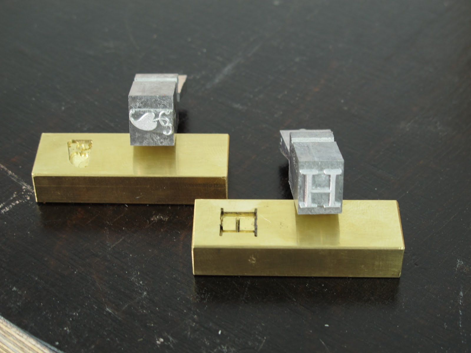
The Iohann Titling H and leaf matrices with castings

Yesterday, Micah Currier pulled a couple of proofs of the H and leaf ornament from the first casting of Iohann Titling. Now that he has established the correct height parallel, we have to make sure there is no stem distortion before he cuts the remaining matrices. According to Theo Rehak, there is a possible width distortion of up to 10% in either direction when the image is translated from pattern to matrix on the Benton Engraver. After scanning Micah's proof in to my computer I overlaid the original drawing for the H to find that there was considerable condensation of the letter form. This weekend, Micah will correct the distortion and re-cut the matrix.

The proof of the H with my original drawing overlaid on top of it